Bonus Engine Redesign
Enabling safe, scalable promotion management across global platforms
RANK INTERACTIVE (WEB APPLICATION) | SENIOR PRODUCT DESIGNER (UX/UI)
The Rank Group is a FTSE-listed international gambling and entertainment company operating both physical venues and digital platforms across the UK and Europe. With more than 7,700 employees and 3.1 million active customers, its internal systems underpin a business generating nearly £800M in annual net gaming revenue.
Across Grosvenor Casinos, Mecca Bingo, and Rank Interactive, promotions play a central role in customer engagement, managed through shared tools used daily by marketing, compliance, and operations teams.
At the centre of this ecosystem is the Bonus Engine.

Understanding the Role of the Bonus Engine.
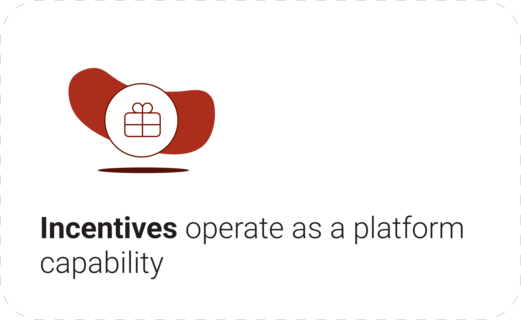
The Bonus Engine isn’t a single feature. It’s the system that defines, targets, and governs incentives across products.
As promotions grew more sophisticated, the legacy engine struggled to keep pace, creating the need for clearer validation and confidence at scale.
DISCOVERY
To fully understand the challenges, I led a structured discovery phase combining research, system analysis, and cross-functional workshops across teams in London, Gibraltar, Mauritius, and Cape Town.
Understanding the Incentive Ecosystem.
To inform the redesign, we mapped how incentives operate across products, teams, and systems within a single platform.
Incentive Ecosystem Overview
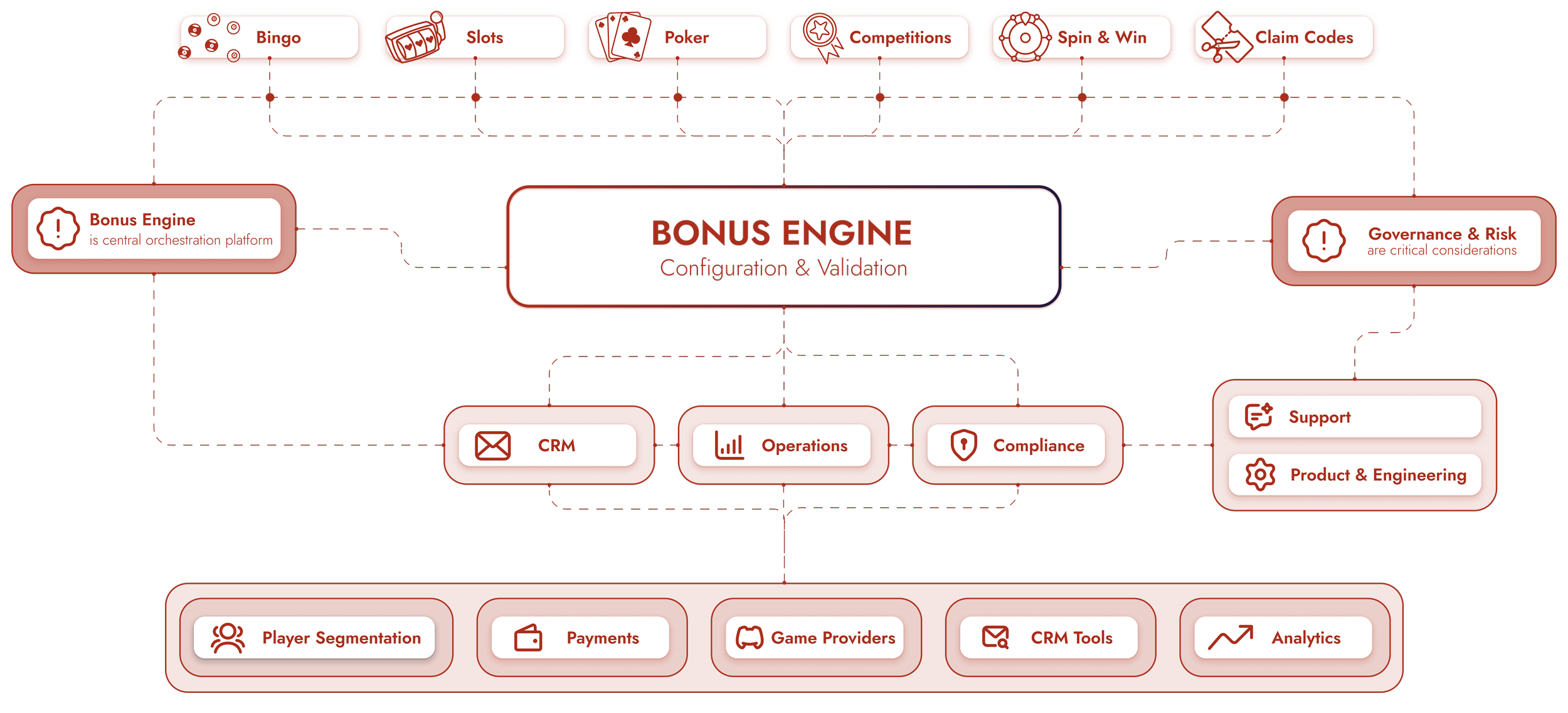
At the centre sits the Bonus Engine, connecting teams with segmentation, payment systems, game providers, and analytics.
Deconstructing the Configuration Architecture.
A cross-functional workshop mapped the Bonus Engine’s fields, dependencies, and validation rules, revealing fragmented and often hidden system logic.
Form Deconstruction & Rules Architecture
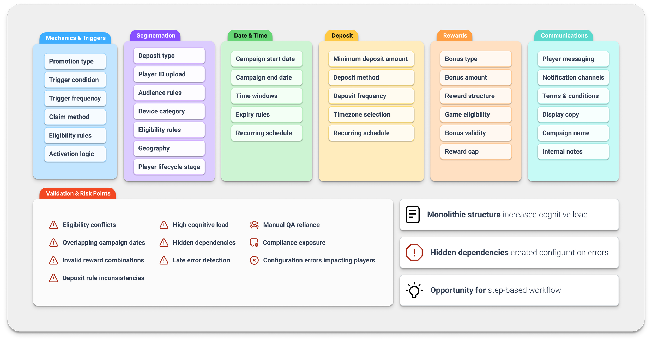
The visual revealed how six interconnected sections shaped promotions, requiring deep system knowledge to avoid errors and highlighting the need for clearer system structure.
Understanding Operational Workflows.
Mapping the promotion lifecycle with Support, Operations, and Compliance revealed the absence of a shared view for monitoring performance or diagnosing issues.
Operational Journey & Dashboard Needs
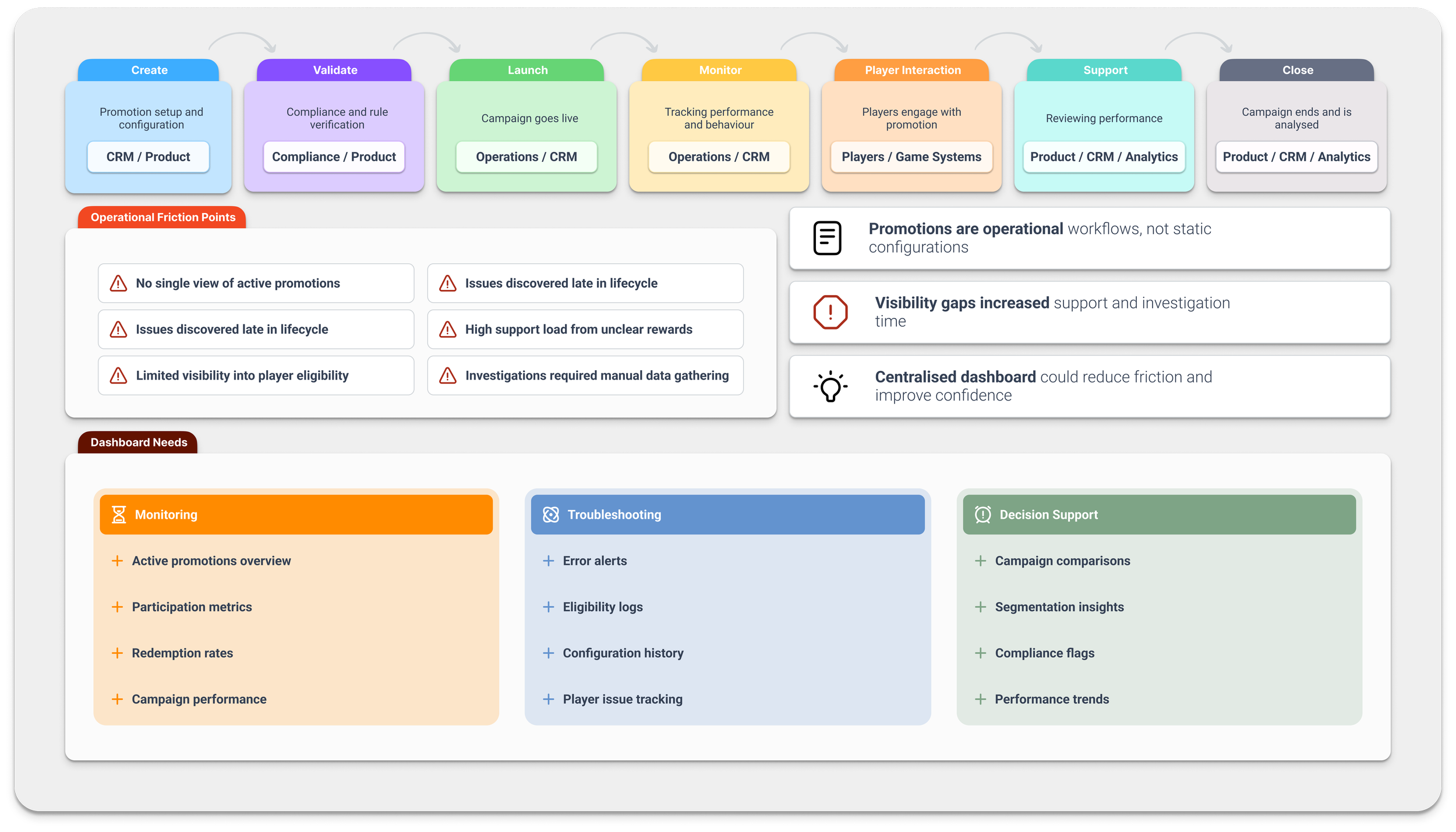
This reframed the challenge as a lifecycle visibility gap, highlighting the need for a centralised dashboard for oversight and decision-making.
Aligning on Design Direction.
Discovery insights were synthesised to align stakeholders on priorities, guiding principles, and success metrics for the redesign.
Design Strategy & Alignment
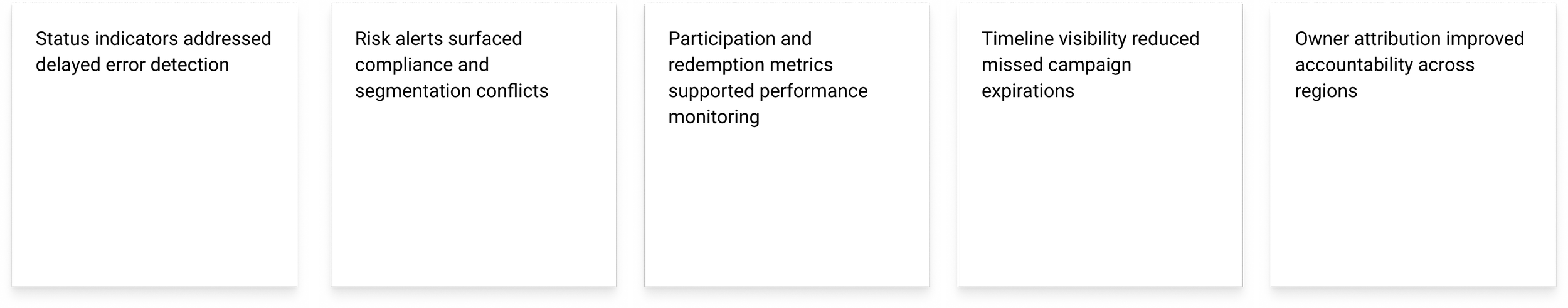
Key Insights.
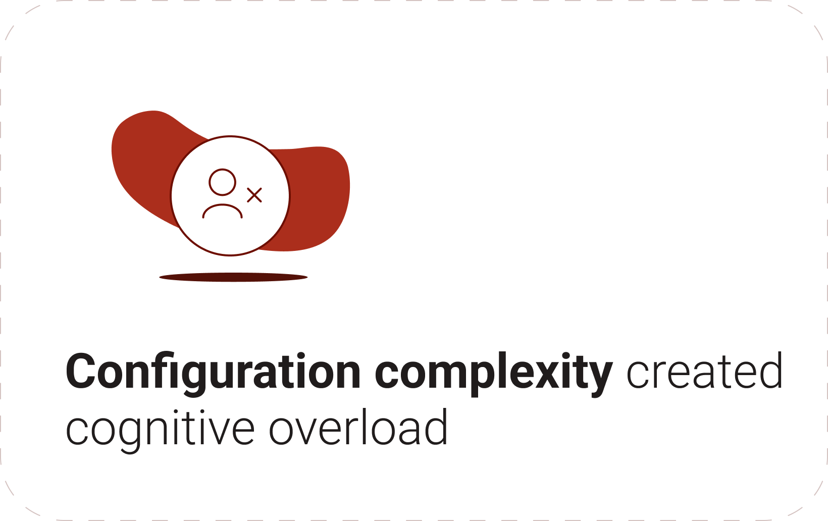


Cross-workshop synthesis revealed that complexity, hidden dependencies, and limited visibility were the primary drivers of errors and inefficiency.
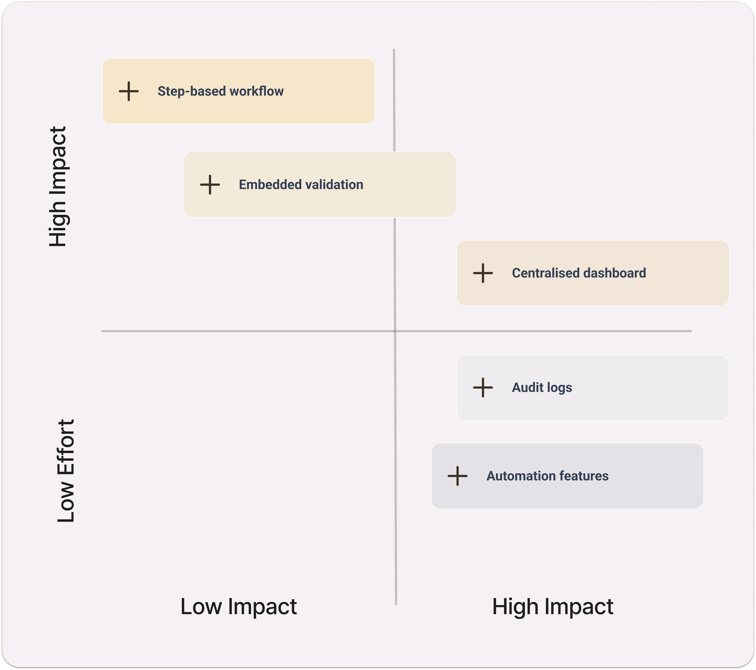
Opportunity Prioritisation.
We prioritised high-impact interventions, focusing on structured workflows, embedded validation, and improved monitoring.
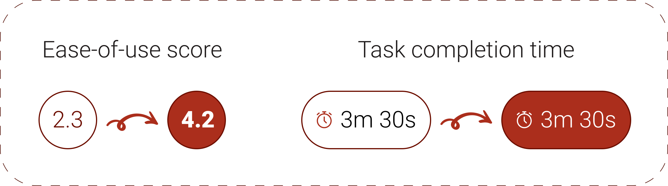
Success Metrics.
Metrics such as ease-of-use, configuration time, support cases, and error rates ensured the redesign could be measured by real operational impact.
DESIGN PRINCIPLES
From these insights, three guiding principles shaped the redesign and aligned stakeholders around a shared, risk-aware rationale.
SOLUTION OVERVIEW
Guided by discovery insights, the Bonus Engine was redesigned to reduce cognitive load and support safer configuration through structured workflows, embedded validation, and improved visibility.
Structured Configuration Flow
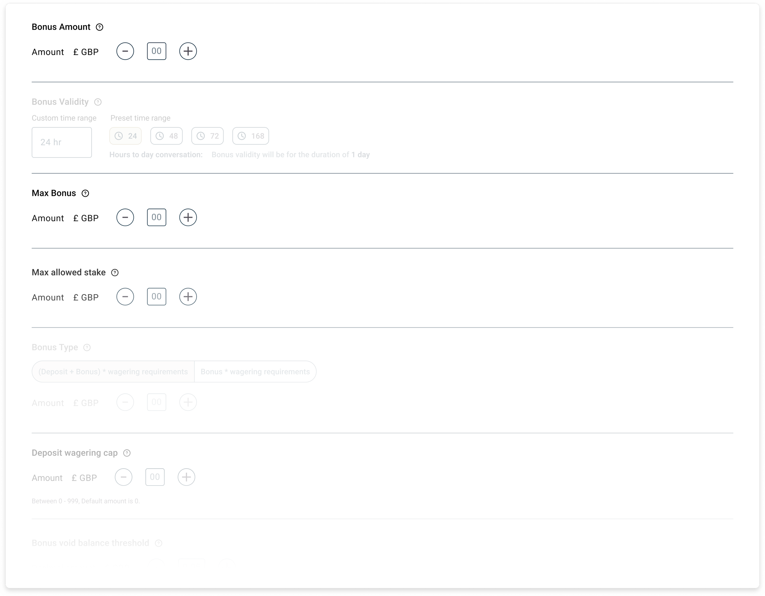
The legacy experience relied on a monolithic form requiring full system knowledge. We replaced it with a step-based flow that grouped decisions into logical stages and reduced cognitive load.
Stepper Exploration
Option 1 — Horizontal Stepper (Top)
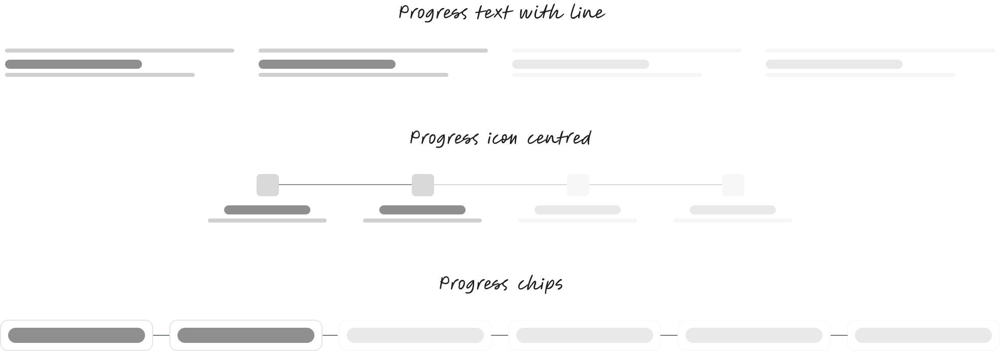
Option 2 — Vertical Sidebar Stepper
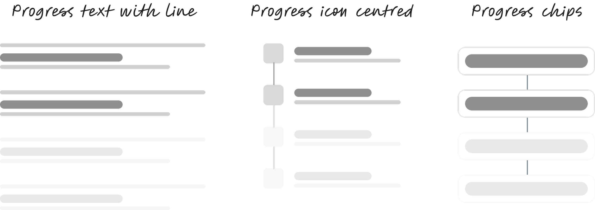
After exploring multiple stepper patterns, we selected a horizontal model for clearer progress, context, and scalability.
Final version stepper design

Why This Matters.

Design for Safe Failure
Validation was embedded within each step, surfacing warnings, risks, and conflicts early to prevent invalid configurations.
Embedded Validation & Alerts
Preventative (disable invalid selections)
Advisory (warning message)
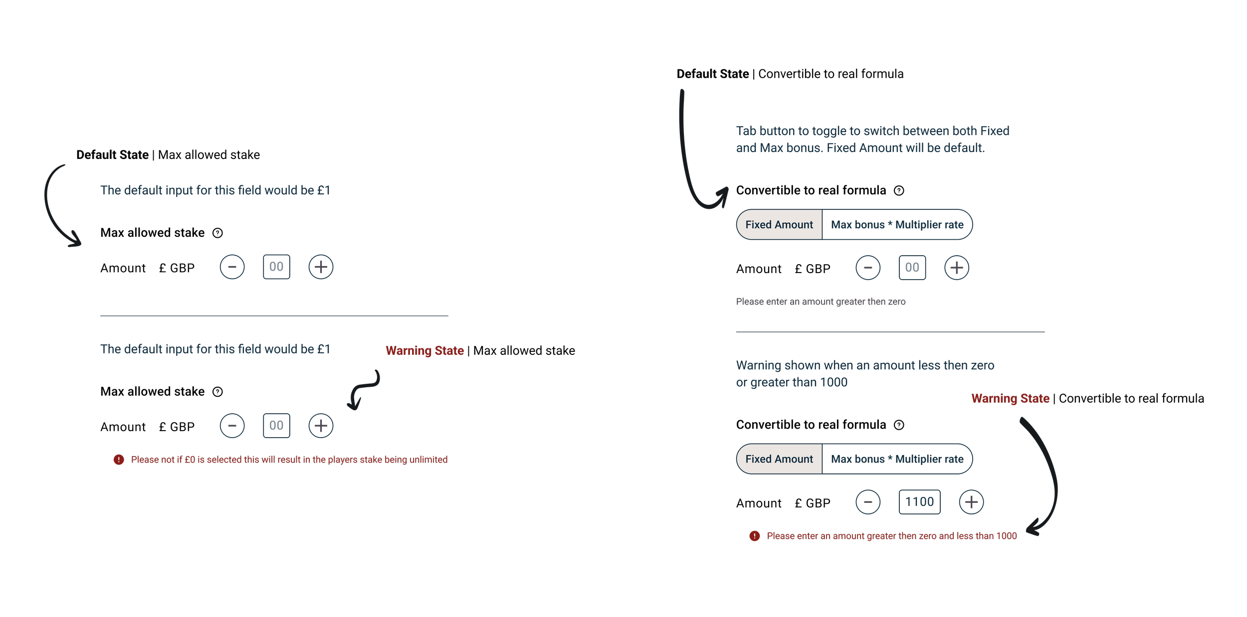
This shifted the system from reactive correction to proactive risk mitigation.
Explicit Rules & Dependencies
System logic was previously hidden, forcing users to rely on experience. We surfaced dependencies directly within the workflow.
Surface System Logic
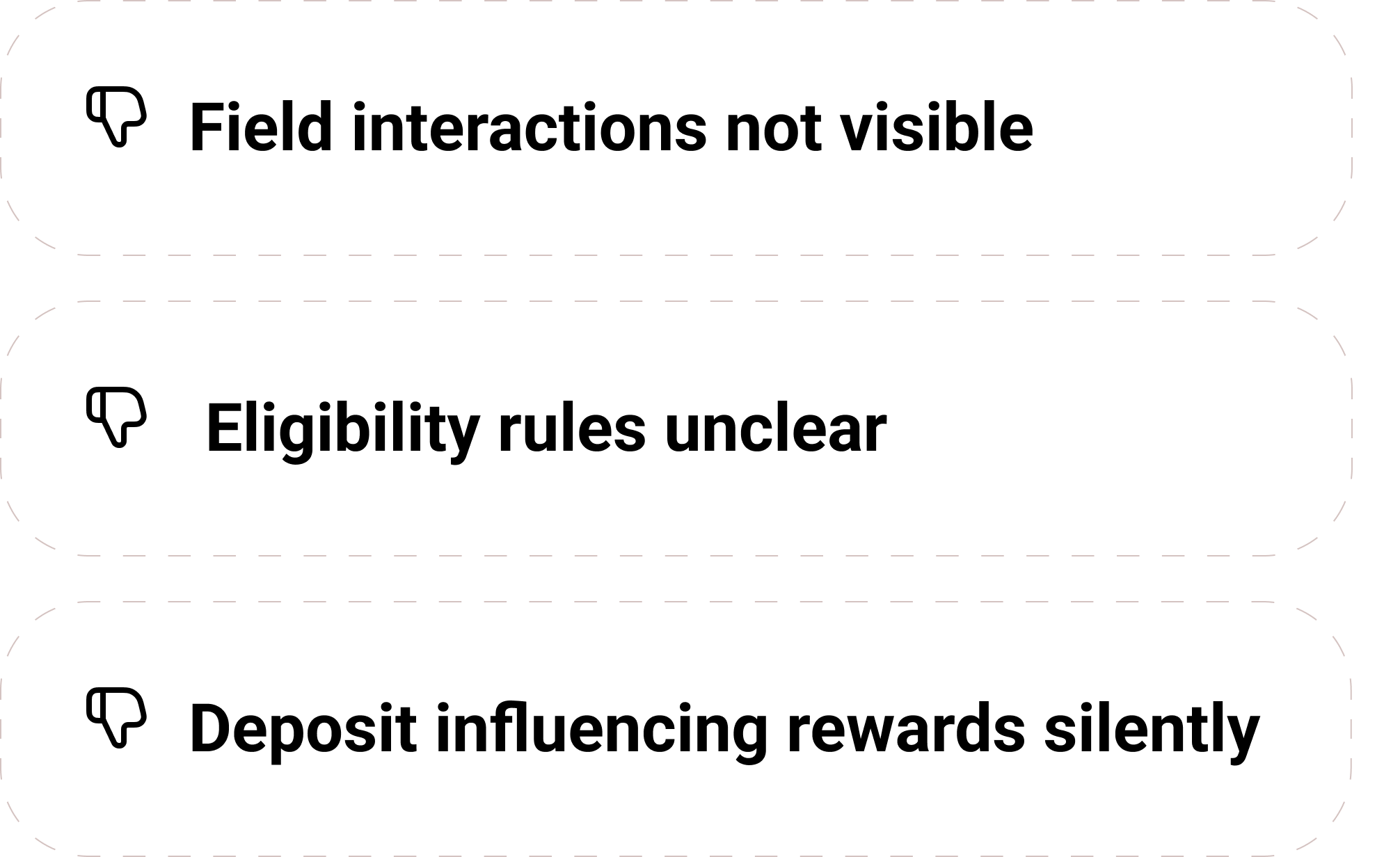
Before: Hidden Dependencies
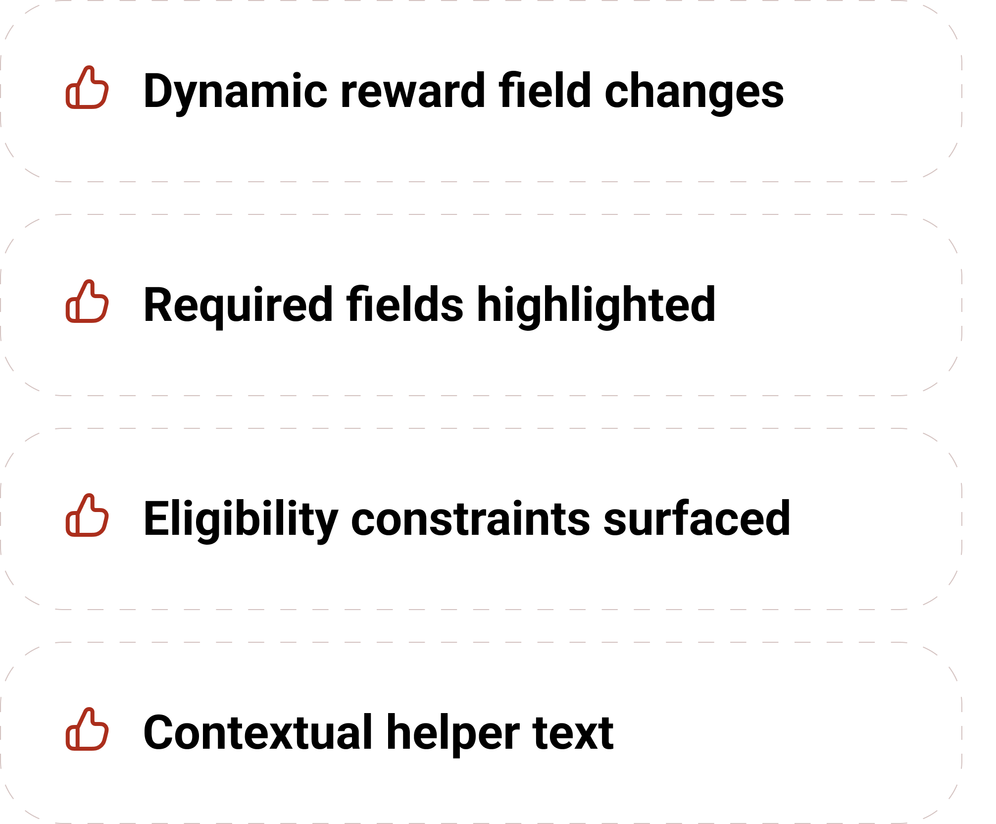
After: Inline System Feedback
The rewards interface became conditional and responsive, only showing fields relevant to the selected mechanic, segmentation, and deposit rules. This reduced ambiguity, prevented incompatible configurations, and made system constraints transparent.
Rewards Section Dynamic Logic
If user selects: Segmentation → First-time depositor | Device → Phone only | Deposit → Min £20
Then Rewards only shows: Eligible game types | Allowed bonus types | Correct wagering logic
Other irrelevant fields are hidden.
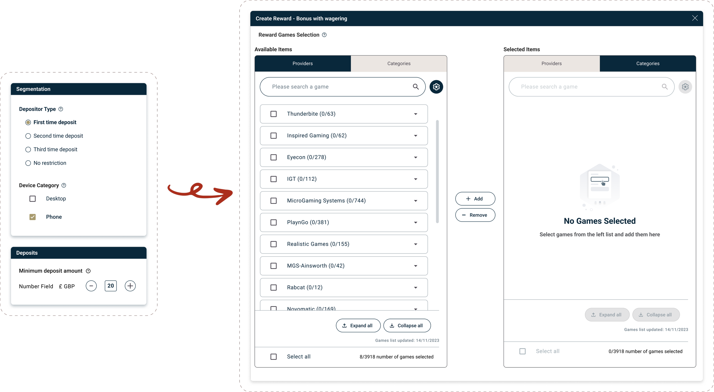
This reduced ambiguity, prevented incompatible configurations, and made system constraints transparent.
Enable Confident Validation
A structured summary layer allowed users to review campaign mechanics, eligibility logic, reward rules, and risk indicators before launch.
Review & Confirmation Layer
Promotion Summary
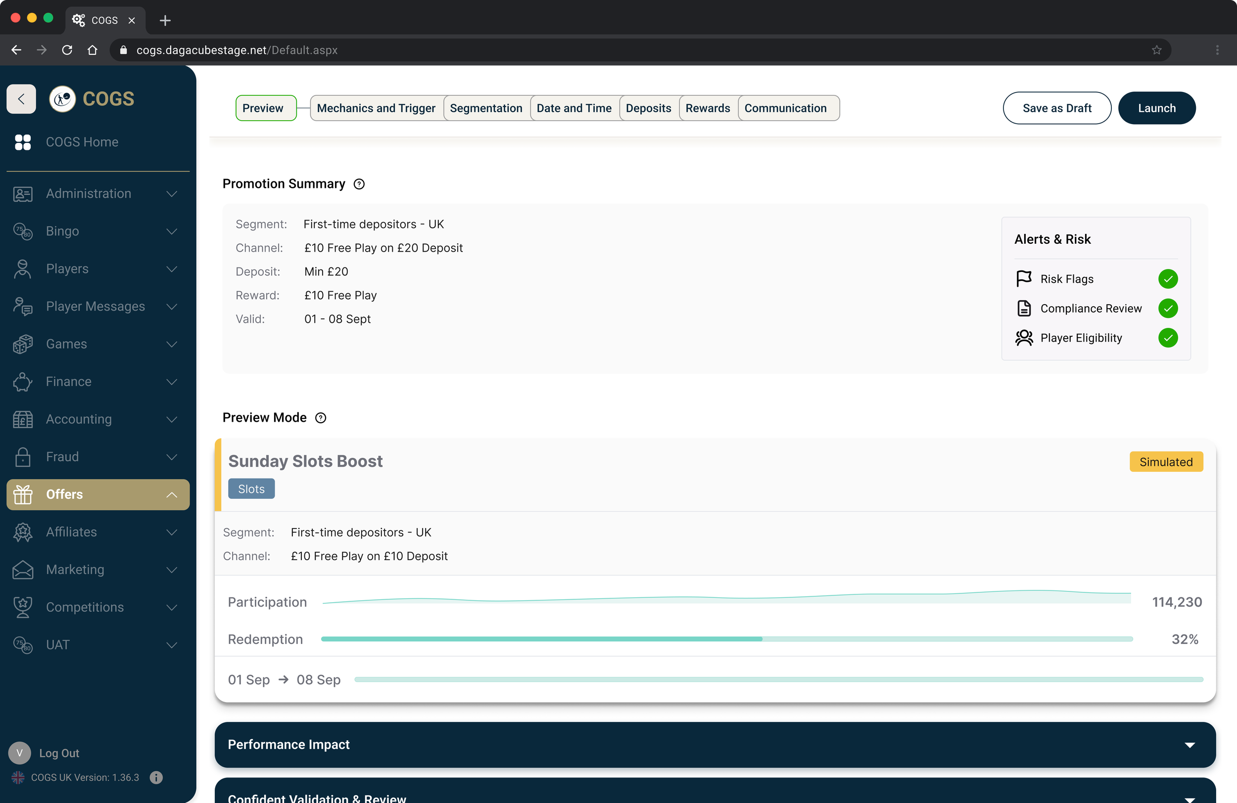
This replaced reliance on manual QA checks with clear system-backed confirmation, increasing user confidence and reducing downstream correction rates.
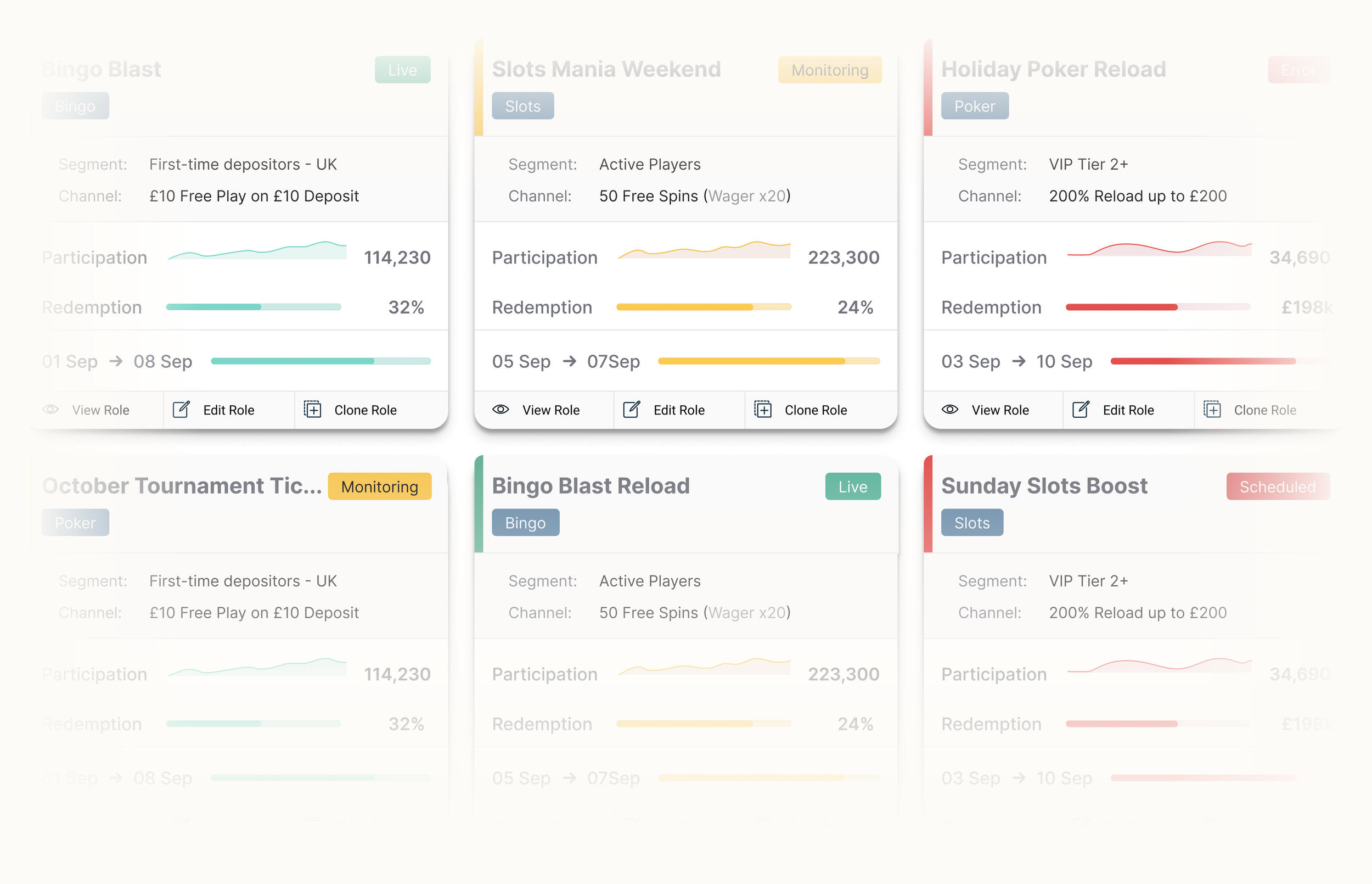
Operational Dashboard
Discovery workshops revealed the absence of a shared source of truth for monitoring campaign performance and identifying issues.
Layout Exploration: List vs Card
Option 1 — Structured Table (List View)
Strengths
High data density
Sortable columns
Familiar enterprise pattern
Strong for bulk comparison
Best for: Power users | Data-heavy workflows | Spreadsheet-oriented tasks
Weaknesses
Low visual hierarchy
Harder to spot risk at a glance
Status easily buried in columns
Less contextual awareness
Option 2 — Campaign Cards
Strengths
Clear status visibility
Campaign individuality
Faster risk scanning
Better hierarchy
Stronger visual separation
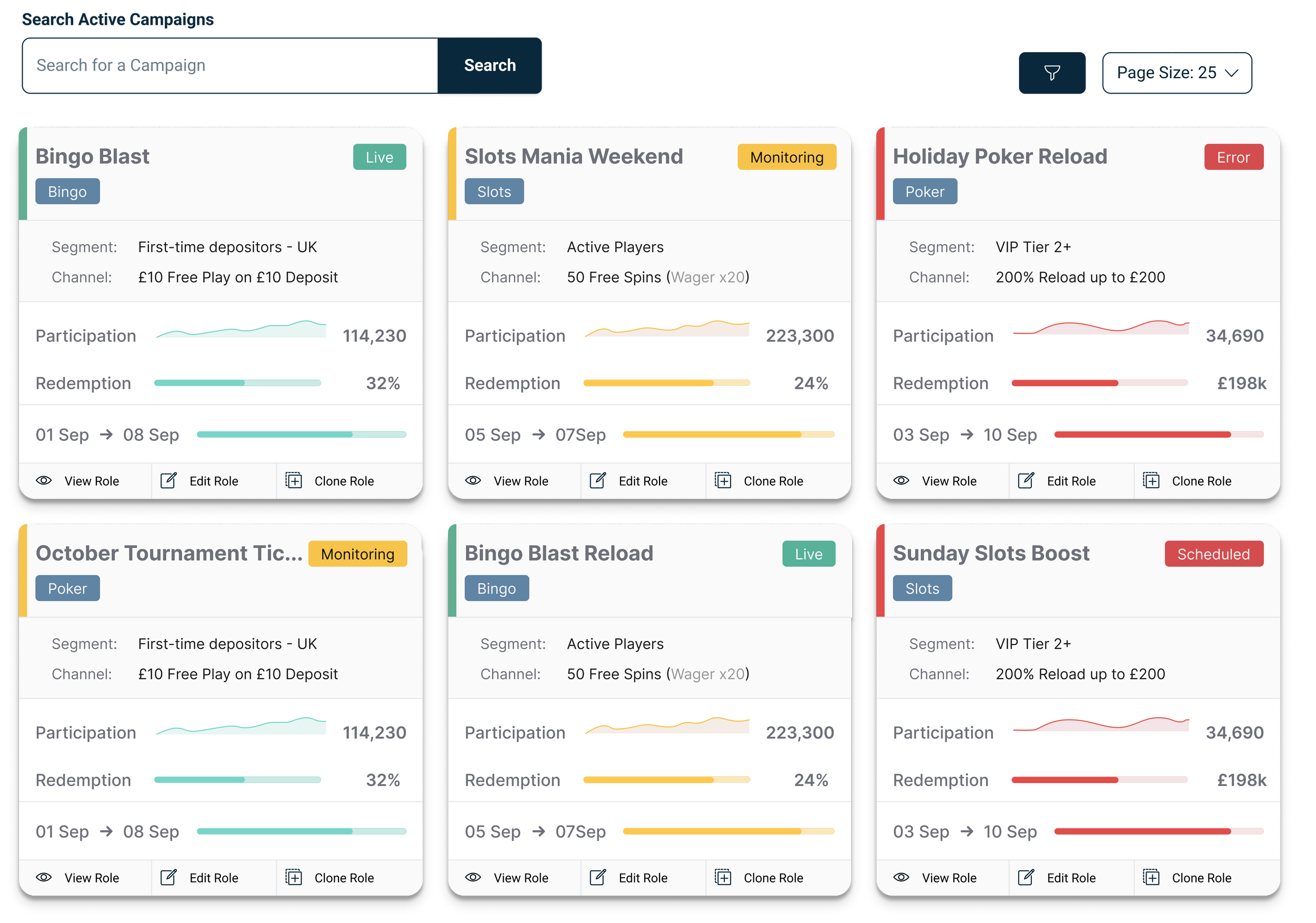
Best for: Monitoring | Operational oversight | Prioritisation | Executive visibility
Weaknesses
Lower density
Less suitable for bulk edits
Exploring List vs Card Layouts
We explored a data table and a campaign card system. While the table offered higher data density, it reduced visibility of campaign risk.
Card Layout
Element Selection Driven by Operational Needs.
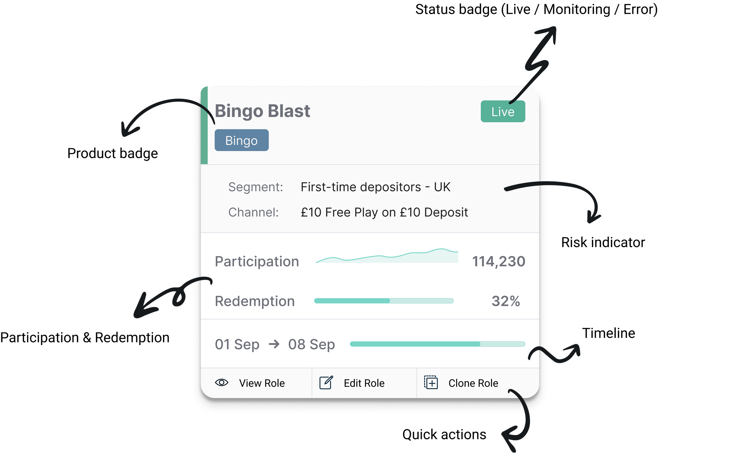
The card layout was selected to prioritise status awareness, surfacing campaign metrics, lifecycle stage, and risks at a glance.
Dashboard components were directly derived from workshop insights:
The interface was designed to support rapid scanning rather than deep data inspection.
Planned Evolution: Dual View Mode
While cards prioritised visibility, some teams preferred high-density comparison views. A future Card/List toggle will support both workflows without fragmenting the experience.
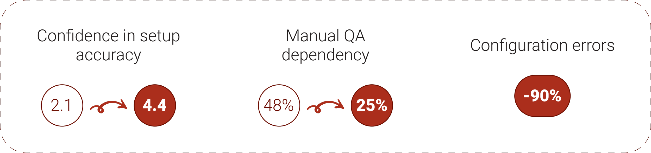
We validated the redesign by measuring usability, efficiency, and configuration accuracy before and after launch.
VALIDATION, OUTCOMES & IMPACT
We measured the redesign’s impact by running the same internal survey before launch and after release.

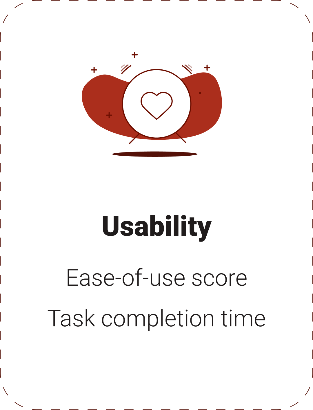
Usability.
A structured workflow and embedded validation improved clarity and ease of promotion setup.

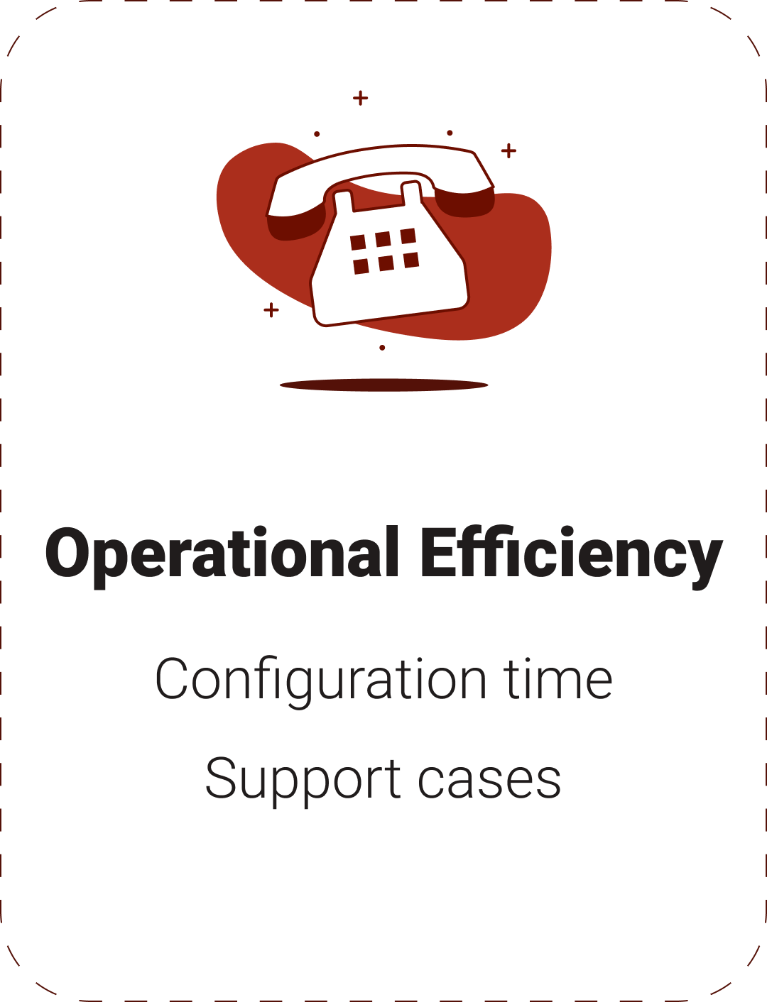
Operational Efficiency.
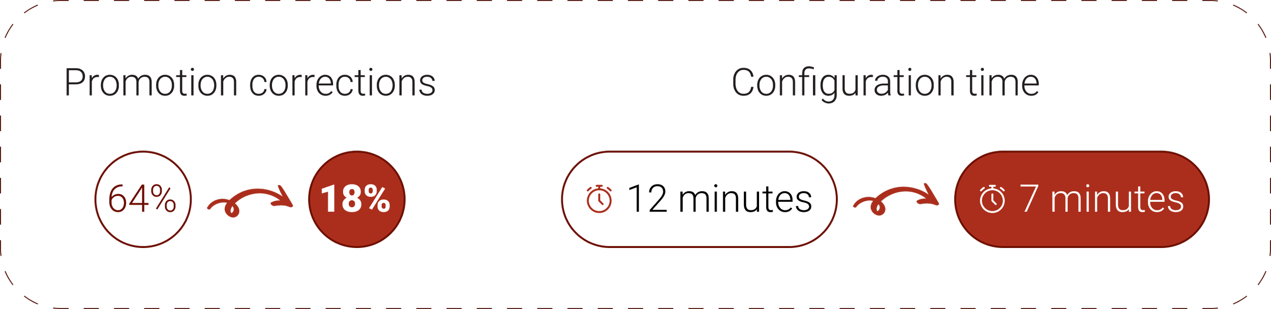
The redesign reduced operational overhead, enabling faster campaign launches with fewer corrections.

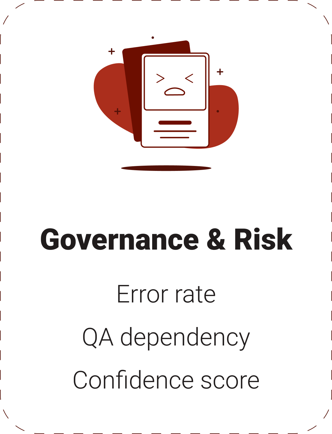
Governance & Risk.
Making rules explicit and embedding validation into the workflow improved trust and prevented invalid configurations before launch.
Impact.
The redesigned Bonus Engine shifted promotion configuration from a high-friction operational task to a structured, reliable workflow. Teams could configure campaigns faster, detect issues earlier, and launch promotions with greater confidence.
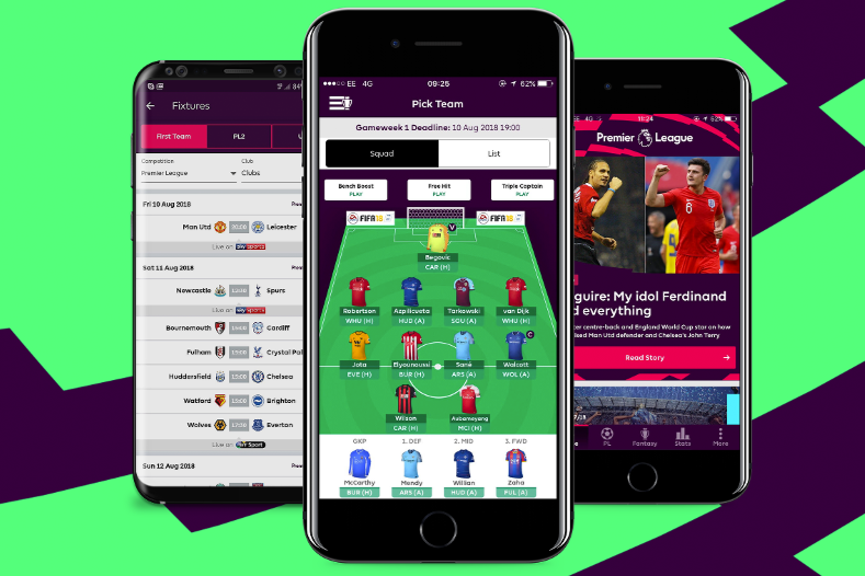
First-Time Deposit Journey
Redesigning a critical moment to increase confidence, clarity, and conversion

Player Management System
Reducing friction and decision fatigue in high-frequency player management tasks