Building an engaging and seamless
player management system
FANTASY FOOTBALL | UX / UI DESIGN
INTRODUCTION
Fantasy Premier League (FPL) is a game that casts you in the role of a fantasy manager. Last season 7.6 million users joined with the task to pick a squad of real-life players who score points for your team based on their performances in their real-world matches.
FPL starts you off with a 100m budget to spend on your squad. This may seem generous, but once you browse the player list and start selecting you'll have to make compromises. Your squad will have 15 players with 11 starting each game week. You as the manager will decide which four to leave on the bench.
Having started many seasons of FPL and not finishing any, I found it difficult to stay engaged. My real pain point was the amount of time needed to stay on top of my team lineup, who to transfer and when to swap my bench.
Why is there a drop of nearly 80% of active users throughout the season?
Looking at the user activity of last season shows that I am not alone. 5.8 million users signed up for FPL in game week one, rising to a further 7.6 million in the first month. After a few months into the new season, the active users drop between 40% - 50%. There is a further drop in active users near the end of the season. Only 1.5 million of the potential 7.6 million users finish out the season.
Objective
To create an engaging and seamless player management system that provides the user with relevant information needed to make an informed decision each game week.
USER RESEARCH OBJECTIVE
To identify pain points in the player management system
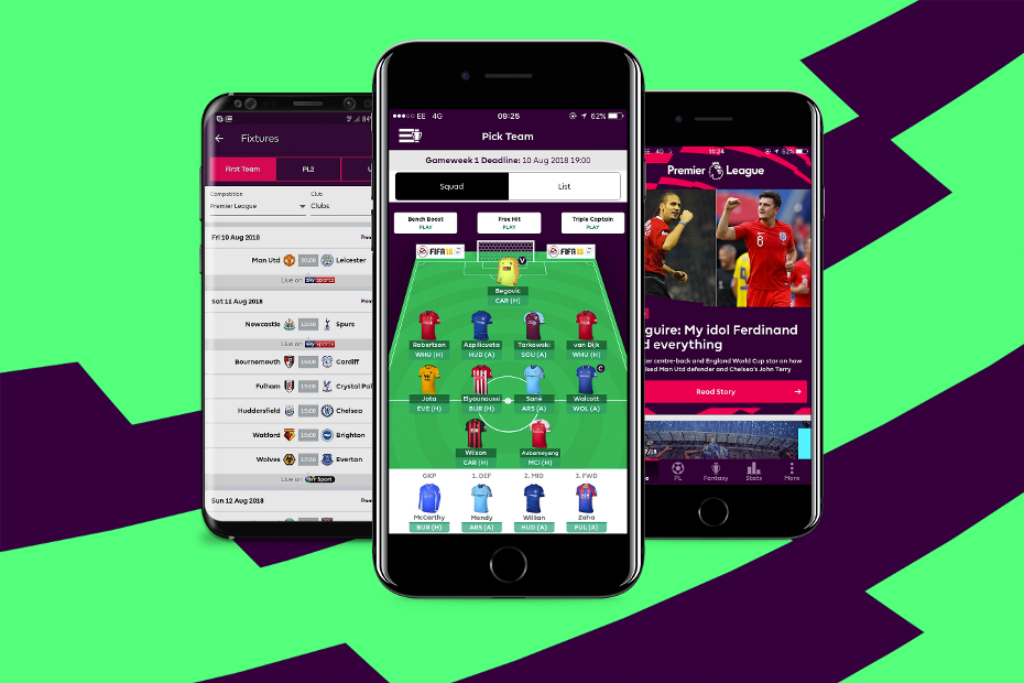
GORILLA USER TESTING
I recruited participants to perform tasks on the Fantasy Football game app. These tasks will help me understand how the users navigate the app and help uncover important information the users need to make decisions.

3 users recruited through a survey

45 minutes of usability testing of the current app
#Task one: Player transfer
Each user has one free transfer to spend on each game week. The user will consider replacing a new player with a current team player. Even though this is not a requirement most users would update the team to maximise points for that game week.
Out of the three assigned tasks, this one would have the most reward and also carries high risk. This task cannot be undone unless you occur a penalty of 4 points loss to execute the second transfer in the same game week.
#Task two: Swap a player from your bench
The users are able to swap players from the beach to the first team. Users can swap a bench player at any point throughout the week, without occurring any costs.
The user will assess which player or players from the bench can have a bigger impact on their team for this game week. This is high reward and high risk as changes get locked in 90 minutes before the first game of the week.
#Task Three: Compare your players with a similar player
Users can compare players stats at any time from their current squad or from the transfer market. This allows users to examine the current team and how they can make improvements to their overall points gain for the following week.
Comparing players has no bearing on this game week but by doing research the users can identify potential transfers for the future.
ANALYSING USER JOURNEY
#Task 1: Player transfer
Two minutes, 47 seconds and 18 steps before the task was abandoned
Step 4
The user realised they were not able to compare stats in this section of the app.
Step 13
They decided which player to transfer but is unable to make the transfer in this section of the app.
Step 17
The user can not find the player in the transfer list, unaware that they were trying to transfer a forward player with a midfielder player.
Step 18
They aborted the transfer.
#Task 2: Swap a bench player
41 seconds and 13 steps to complete the task
Step 5
The User identifies the Stats when determining which player should be moved to the first team.
(The coloured numbers running down the left side of the screen is the difficulty level of the opposing team that the selected player will face.)
Step 9
This player has easier opposition over the next few weeks than the player shown on step 5. The user has kept this player in the first team.
#Task 3: Compare one of your players with a similar player
Three minutes, 4 seconds and 25 steps to compare players
Steps 4 to 8
The user examines the current defenders in the team, looking at the player's overall stats and opposition ranking. After the user made a decision on which player to potentially replace, they navigated to the compare feature section.
Steps 12 to 14
While using the player search bar the user expected to find additional filters than what was available in the compare feature section.
Step 15
The user abandons the compare feature section and loads the transfer page.
Step 19 to 24
They use the sort feature in the player transfer section to search for a suitable player to compare.
INSIGHTS
I grouped all the observations from the user interviews. This helped me identify the key areas where the users struggled and the additional information they needed when making decisions.
Unable to compare relevant stats in the compare feature
“I was unable to compare the relevant stats I needed, so I had to go back to the transfer section.”
“I was not aware the player I was replacing was not a forward and in fact was a midfielder.”
Confusing player positions
“I look at the next few fixtures the players are involved in when deciding which player to swap or transfer. If the next few fixtures are high (red) I would look to replace this player.”
‘Next few fixtures’ feature is one of the stats used when deciding on replacing players
“I find the compare feature only useful when you know which player you want to compare. The feature is limited to what you can search but the transfer section shows more player information.”
Compare feature has limited amount of stats available
“I am not sure who to search for in the compare feature section. All I am given is a long list of player names so I am not able to sort through any attributes.”
Unable to sort through attributes
WIREFRAMES & PROTOTYPES
Identifying these potential user pain points helped uncover areas for improvement. The proposed updates are designed to help the user navigate these tasks with ease:
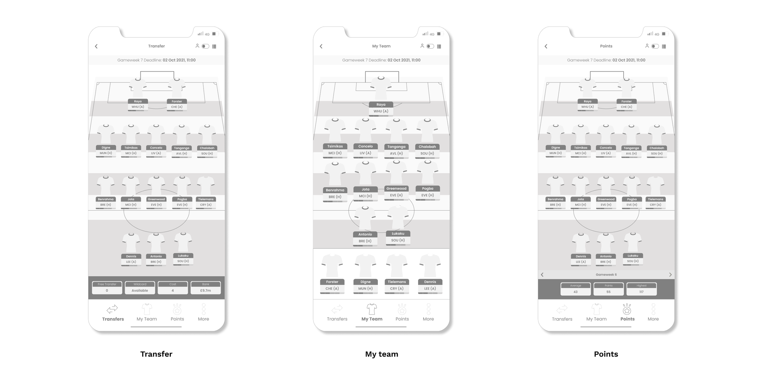
1. Introduce a secondary navigation
I introduced a new navigation system that sits inside the ‘pick team’ section. This will provide the user the ability to toggle between the three-game modes which are points, my team and transfers.
The squad and list buttons are redesigned into a toggle button. In the new navigation system the bench boost, free hit and triple captain buttons are moved inside the ‘more’ menu.
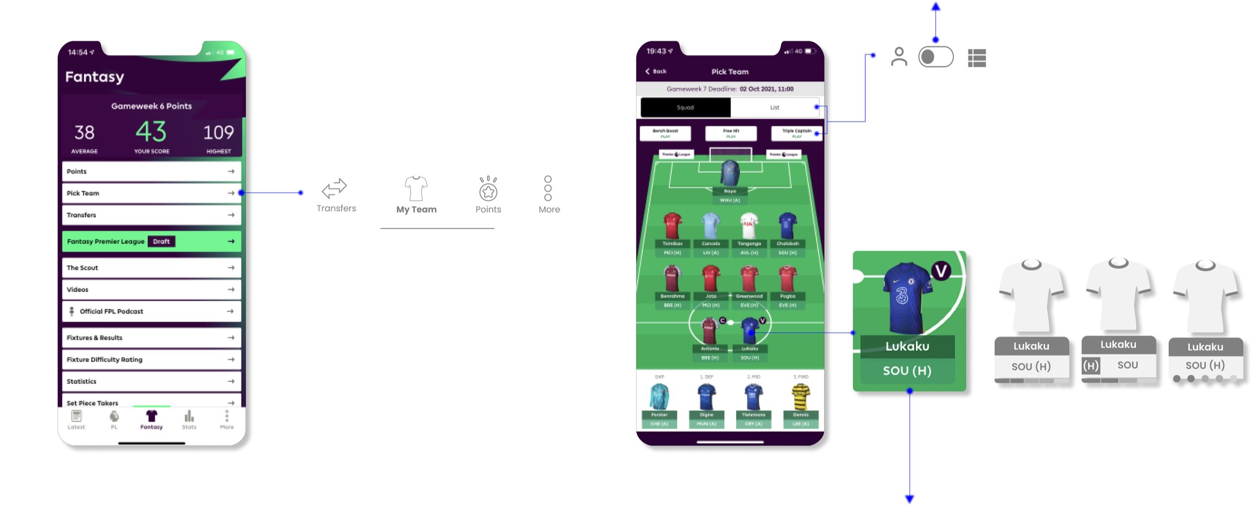
The player icons are redesigned to incorporate the next 5 fixtures.
GAME MODES
Wireframes
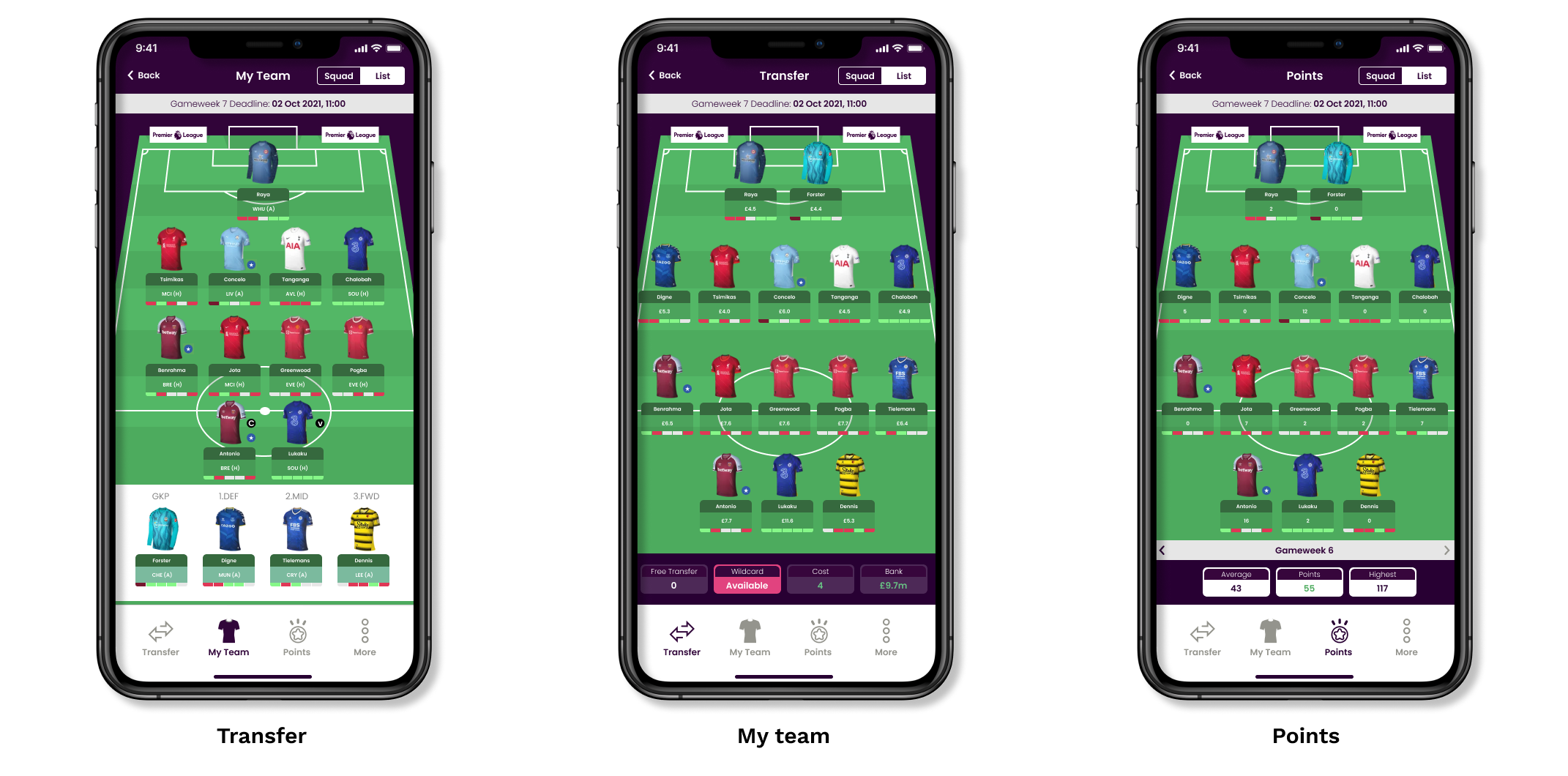
‘NEXT FEW FIXTURES’
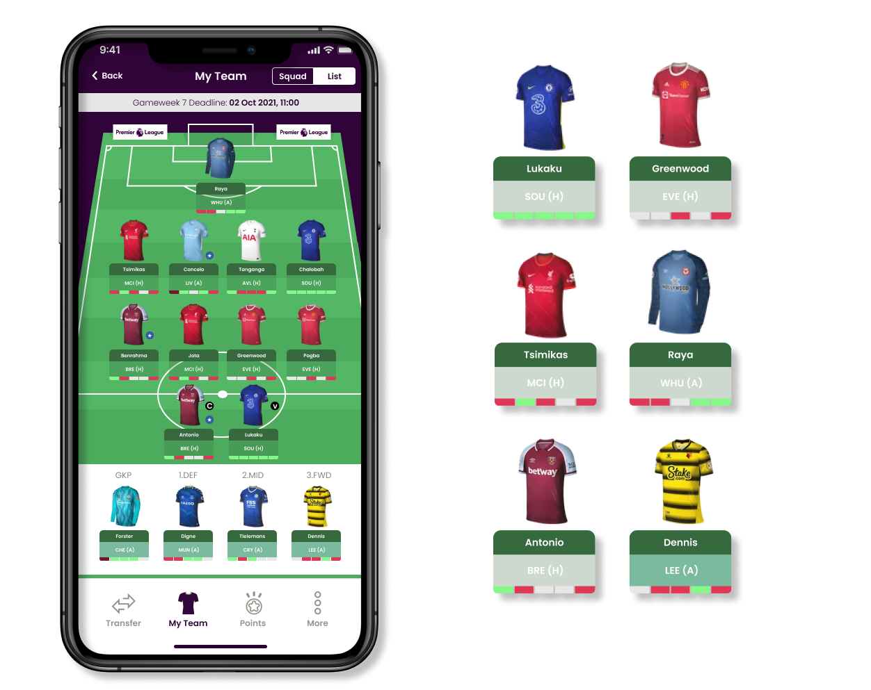
‘Next few fixtures’ feature is one of the stats used when deciding on replacing players. I have added this to the player icons, the users can view this information at a glance.
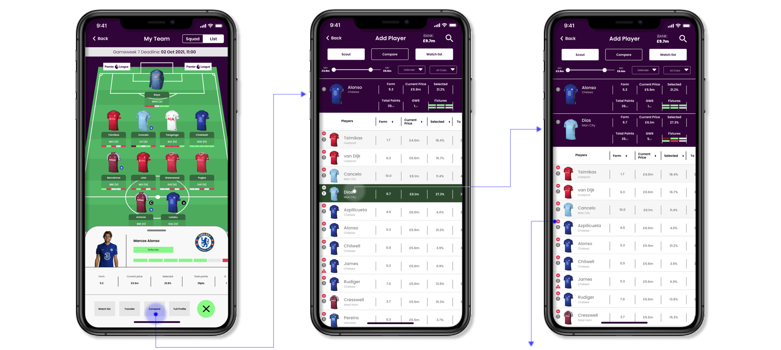
2. Add ‘next few features’ stats to the player information card
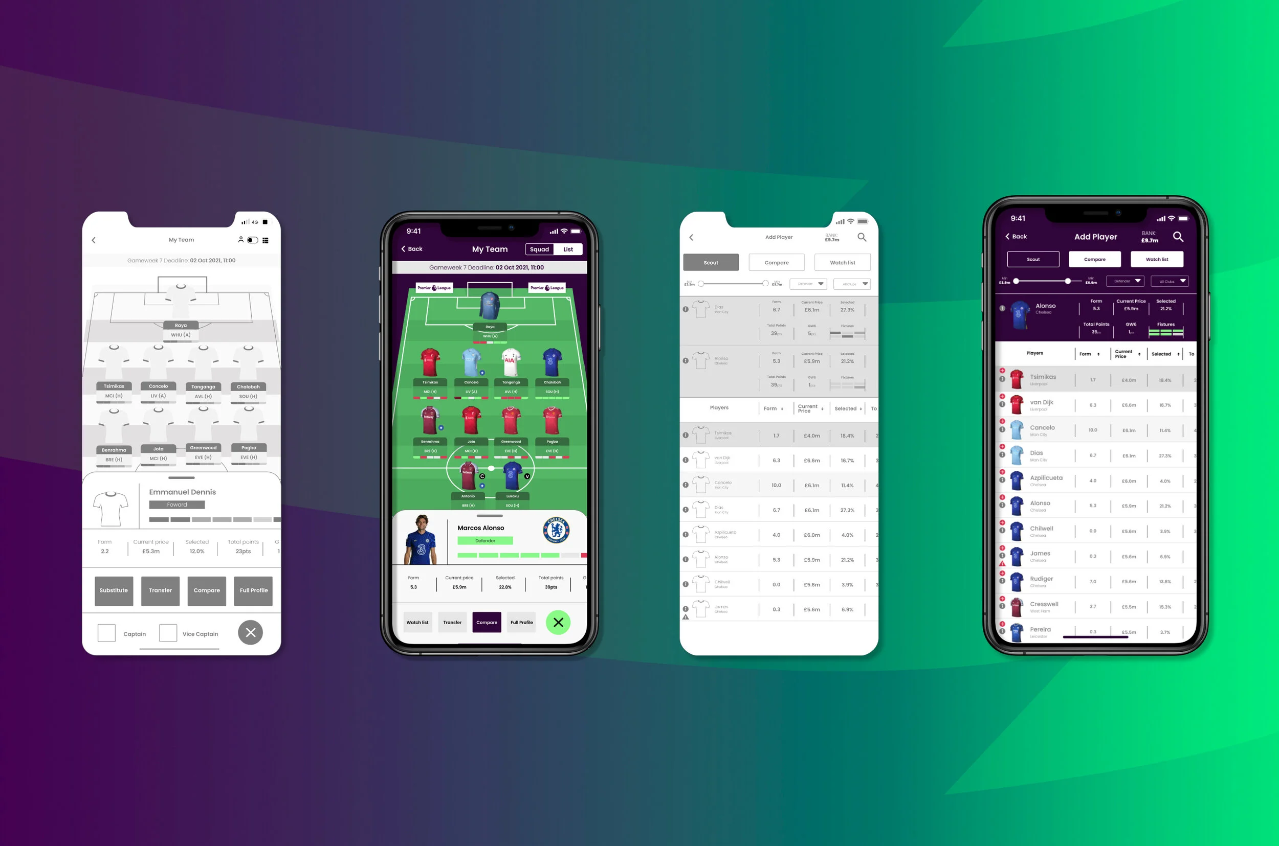
From the research, I identified 5 important stats the player need to make quick decisions. These stats can be seen at a glance during the player selection. This way the users have all the relevant information readily available when choosing which player to add or remove.
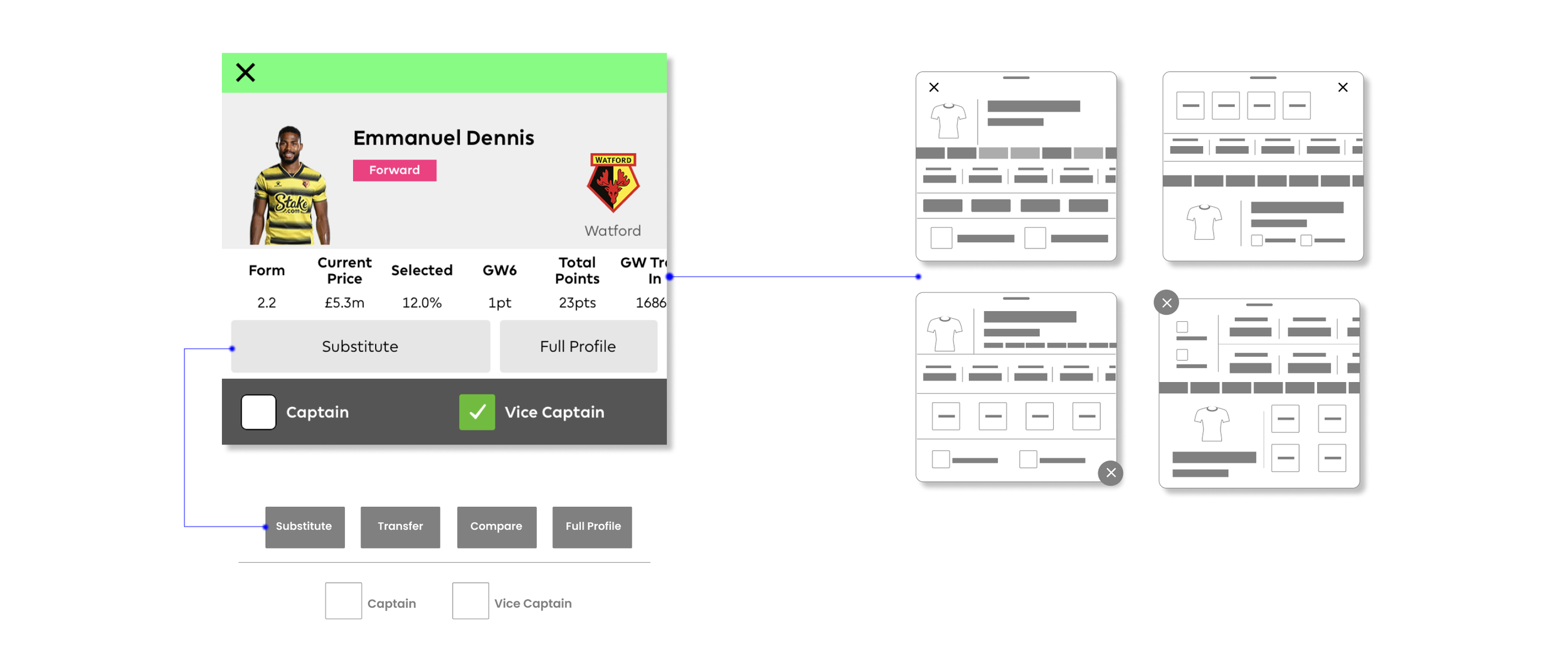
By adding a compare and transfer button in the player info card, the number of steps currently needed can be reduced. In the existing design, the user will need to navigate away from this page to use both these functions.
PLAYER INFO
Low fidelity wireframes
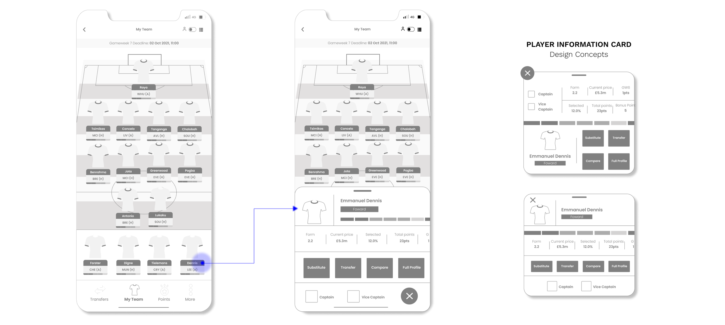
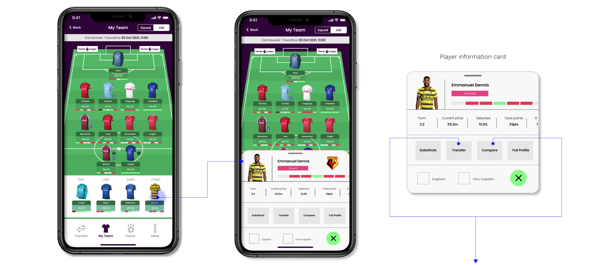
Transfer and compare buttons added to the player information card.
3. Create a consistent search system and add a visual filter search system
The player search feature is not consistent throughout the app. The detailed search function is only accessible from the transfer section.
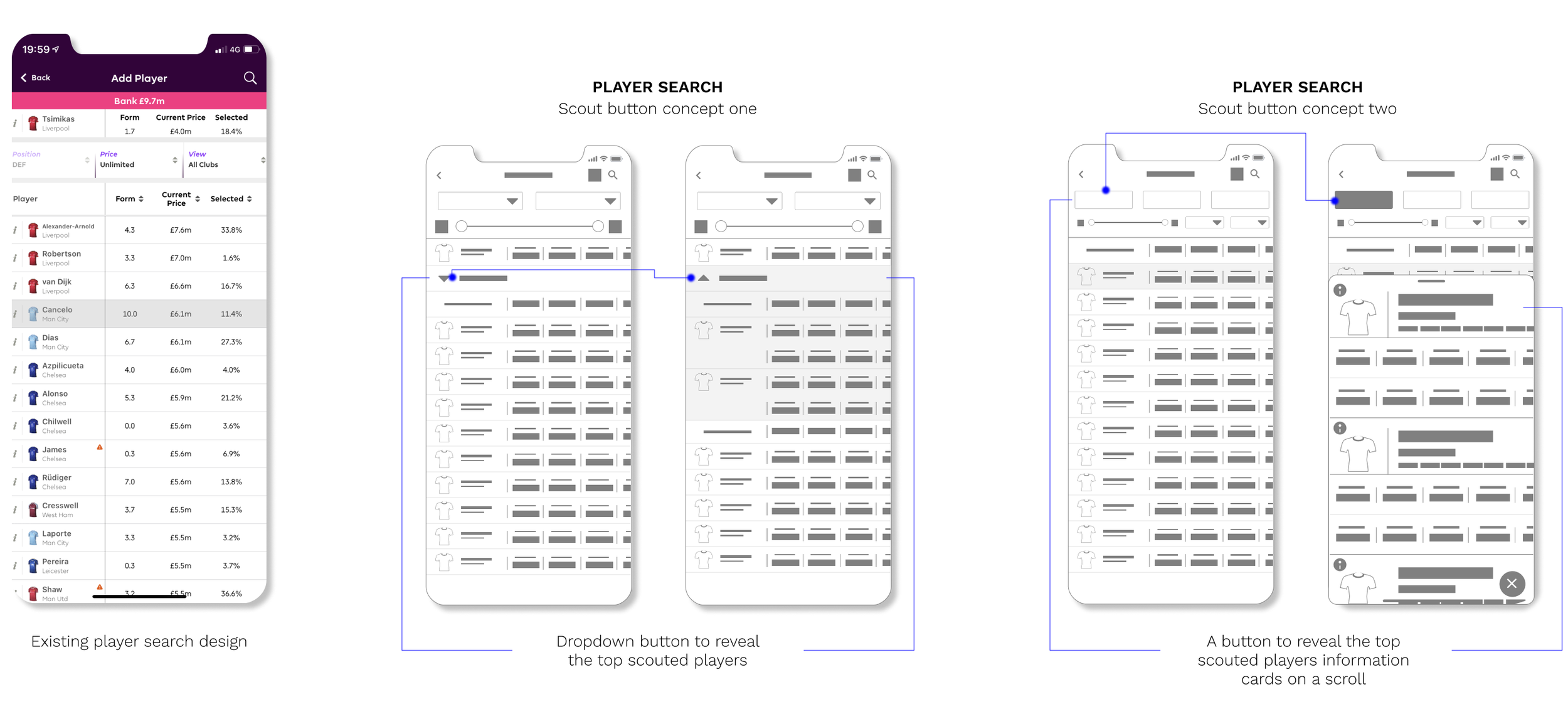
The search function will now have the player compare feature, a new scout feature and a player watch list.
PLAYER SEARCH
Low fidelity wireframes
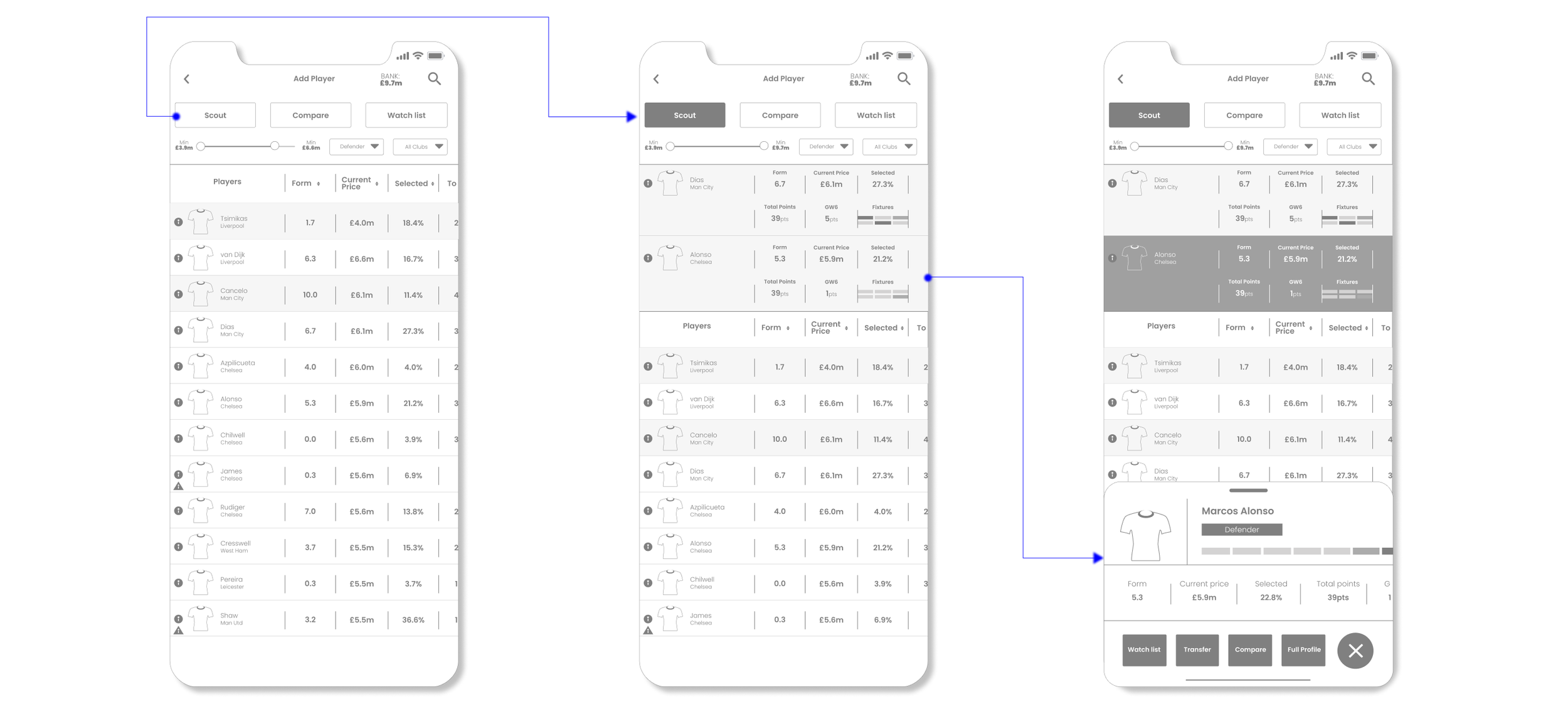
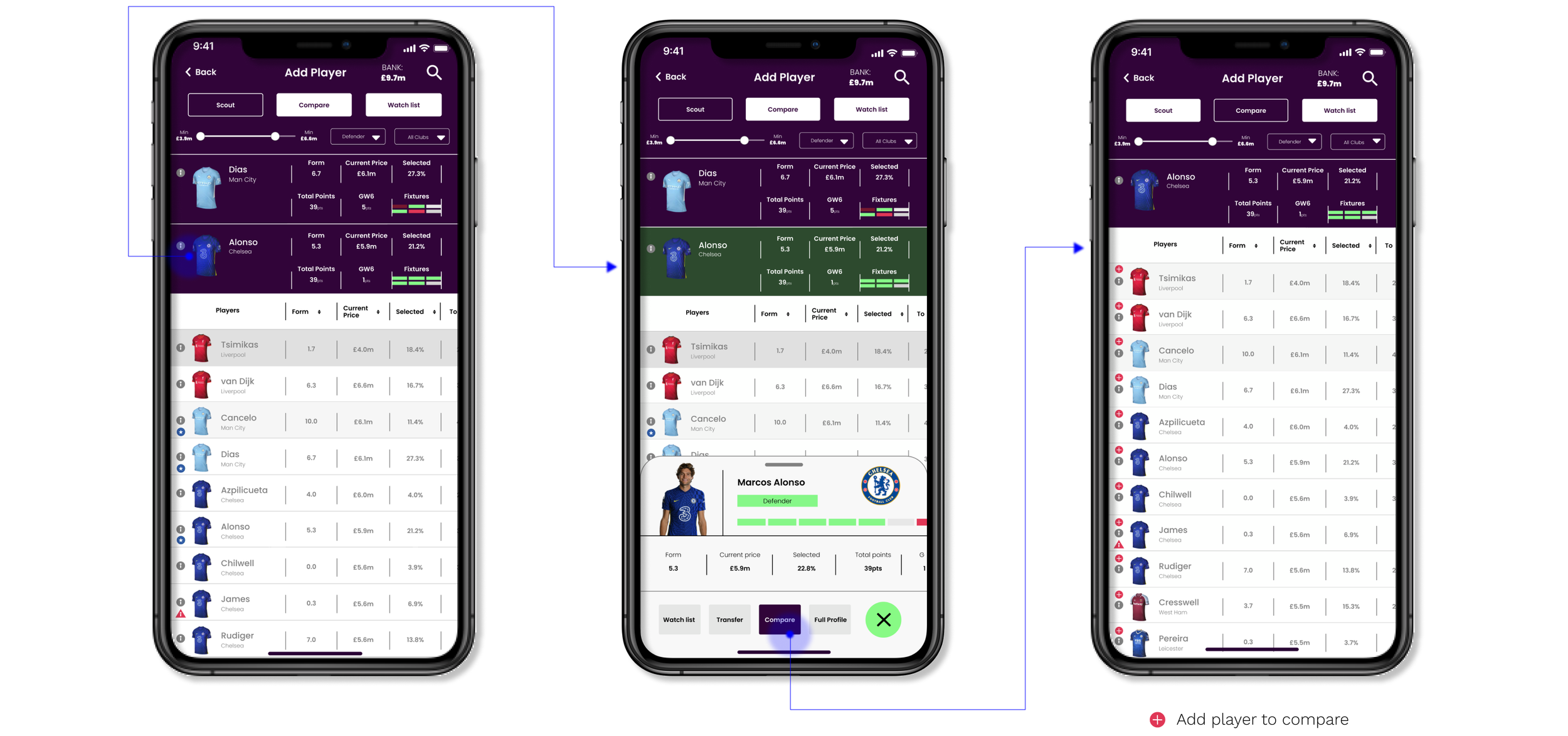
4. Add the player comparison system within the ‘transfer’ section
In the existing design, the compare feature is separate from any other search feature within the entire app.
From the guerrilla user testing, I identified that it took multiple steps to reach the compare function from the transfer mode. Adding a compare button in the player information card not only makes the process quicker and seamless for the user but also cuts down the need to navigate to another area of the app.
COMPARE PLAYER SYSTEM
Low fidelity wireframes
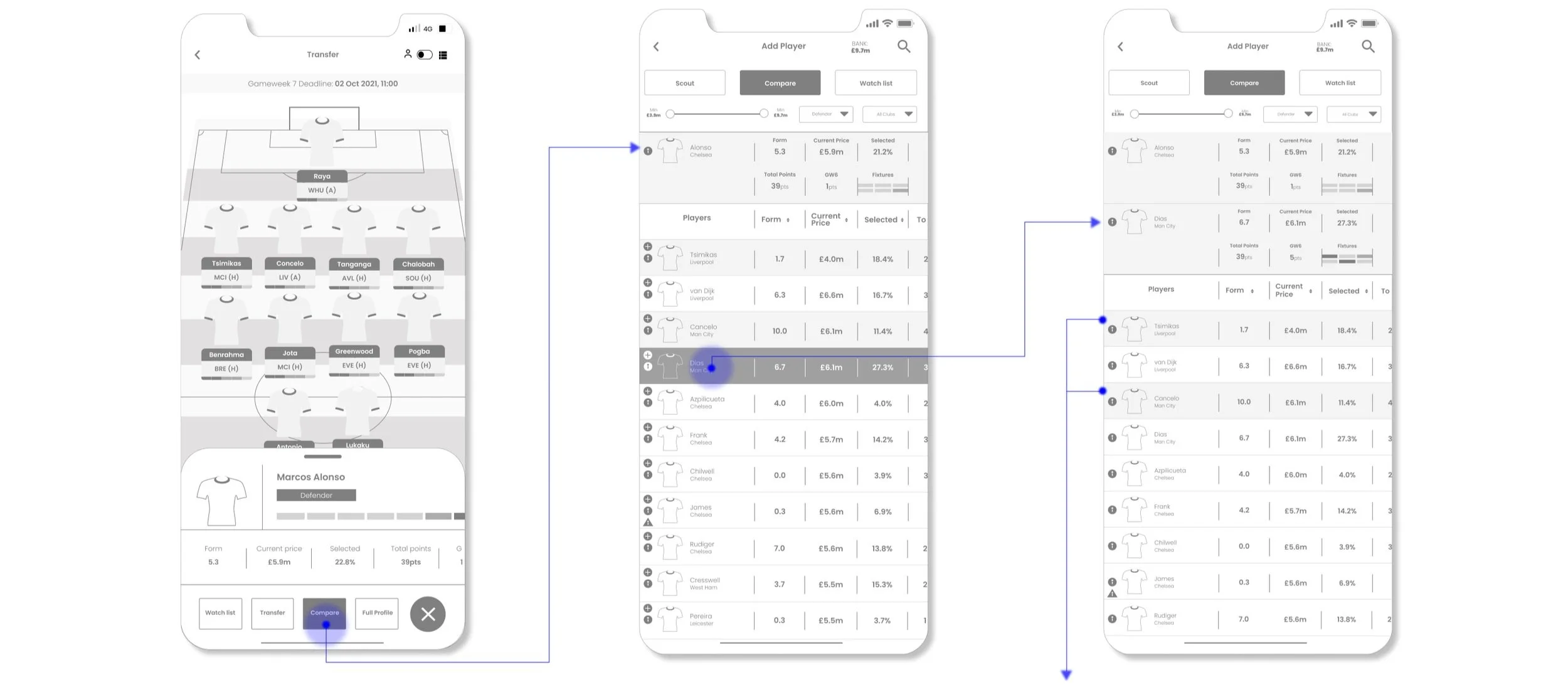
The two players highlighted are to visually show the user that they are in their current team.
The user are able continuously add players to compare. The newly added players will stack under the current two players.
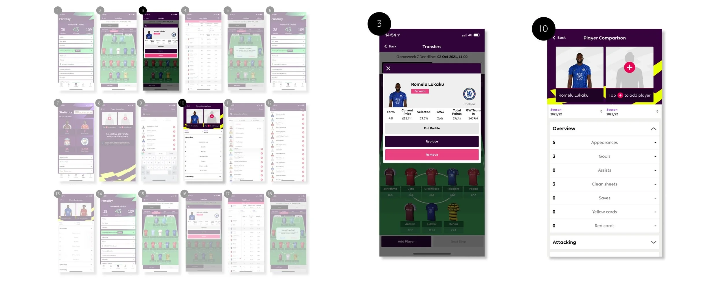
Interactive prototypes
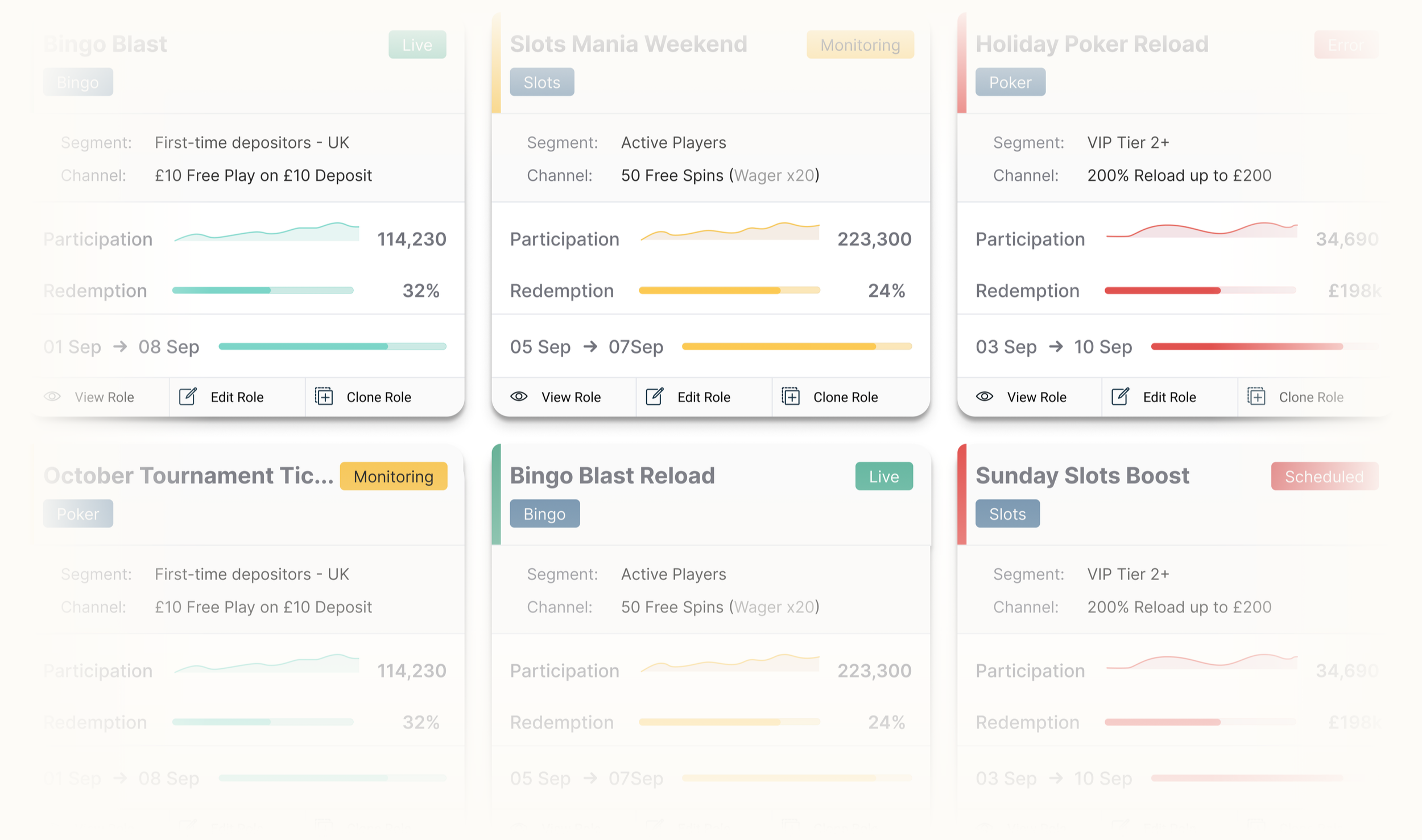
Redesigning the bonus engine to improve promotion configuration and operational confidence
Improving clarity, governance, and efficiency for high-risk promotion configuration
Redesigning the first deposit experience to increase confidence and conversion
Improving clarity at the moment of commitment led to measurable gains in completion, reduced confusion, and lower support demand across the journey.