Redesigning the First Deposit Experience at Grosvenor Casinos
Building confidence at a critical commercial moment
GROSVENOR CASINO APP & WEB | SENIOR PRODUCT DESIGNER (UX/UI)
Grosvenor Casinos is the UK’s largest multi-channel casino operator, serving 1.7M+ customers annually across 50+ venues and digital platforms. As part of Rank Group’s £795M net gaming revenue business, the first-time deposit is one of the most commercially critical moments in the customer lifecycle.
The first-time deposit is where curiosity becomes commitment, the moment users move from exploring the product to risking real money.
Between August 2024 and March 2025, over 18,000 customers contacted support about sign-up bonuses, with 64% reporting they hadn’t received their reward, a clear signal that confidence was breaking down at the moment users were asked to commit real money.
Understanding why confidence broke down required stepping back and examining the experience end-to-end.
OPPORTUNITY
The first-time deposit sits at the intersection of acquisition, revenue, and trust. With over 1.7 million customers annually and digital revenues exceeding £200M, even small improvements at this step can have outsized commercial impact.
Despite strong acquisition, users hesitated at deposit due to uncertainty around bonuses and outcomes.
This created an opportunity to clarify expectations, reduce perceived risk, and reinforce trust at the moment of deposit.
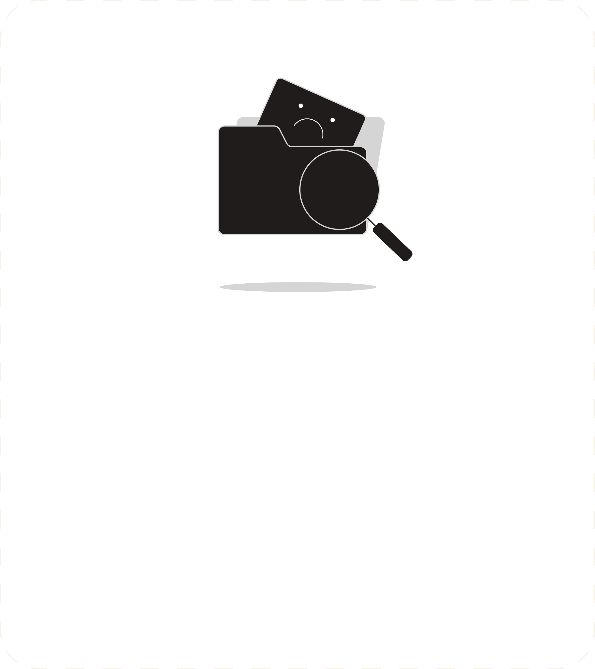
ANALYSIS & DISCOVERY
To understand the drop in confidence at deposit, we analysed support data and the end-to-end journey to determine whether hesitation was driven by usability friction, technical issues, or mismatched expectations.
Bonus-related queries averaged 2,200+ cases per month, with most users believing they hadn’t received their reward after depositing.
While some cases were genuine eligibility issues, the majority stemmed from unclear expectations around how bonuses worked. Secondary themes around eligibility, wagering requirements, and activation suggested the problem wasn’t isolated errors but a broader clarity gap in the deposit experience.
Journey mapping showed uncertainty clustering around three key moments: bonus evaluation, deposit confirmation, and reward outcome, where users formed expectations about value and risk.
KEY INSIGHTS
Support data and journey analysis revealed three consistent patterns behind the confidence breakdown at deposit.
The core problem wasn’t lack of motivation, it was lack of predictability.
Users were willing to deposit, but unsure what would happen next.
PROBLEM DEFINITION
First-time depositors were arriving with strong intent but lacked the clarity needed to commit with confidence.
Uncertainty around bonus eligibility, reward outcomes, and system behaviour created hesitation at the exact moment users were asked to risk real money.
As a result, the experience introduced friction at a critical commercial touchpoint, impacting conversion, increasing support demand, and weakening trust early in the lifecycle.
The problem wasn’t motivation, it was a mismatch between user expectations and what the experience revealed..
MAPPING THE BONUS SYSTEM
Before redesigning the user experience, it was essential to understand how the bonus system actually behaved behind the scenes.
Bonuses are governed by eligibility checks and reward rules that determine when players receive value. While deterministic, this logic wasn’t visible to users, creating a gap between system behaviour and perceived outcomes.
Mapping the bonus journey clarified the system’s complexity, revealing where expectations diverged from reality and where clarity was needed. This understanding shaped the front-end experience around clearer expectations and visible outcomes.
DEFINING THE FTD EXPERIENCE
With a clear understanding of how bonuses operated, we mapped the ideal first-time deposit experience from the user’s perspective.
The focus was on reinforcing confidence at the moments that mattered most, before committing to a bonus, during the deposit action, and immediately after payment.
This journey became the blueprint for the redesign, ensuring each interaction aligned with both system behaviour and user expectations.
MVP DEFINITION
With a clear understanding of system behaviour, user expectations, and key confidence moments, we focused on the smallest changes that could meaningfully improve the experience.
Instead of redesigning the whole onboarding or bonus ecosystem, the MVP focused on the moment of commitment where uncertainty was highest.
Improvements were explored across onboarding, bonus understanding, the cashier, and post-deposit feedback, but only some directly influenced the decision to deposit.
We focused on reducing perceived risk at the moment of commitment rather than expanding the solution across the wider ecosystem.
SOLUTION
The final experience focused on reinforcing confidence across three moments: before deposit, during the transaction, and immediately after payment. Each design decision was informed by earlier insights to address the root causes of uncertainty.
CLARITY BEFORE COMMITMENT | Helping users understand value upfront
To address the expectation gap, clarity was introduced at the earliest possible moment in the journey.
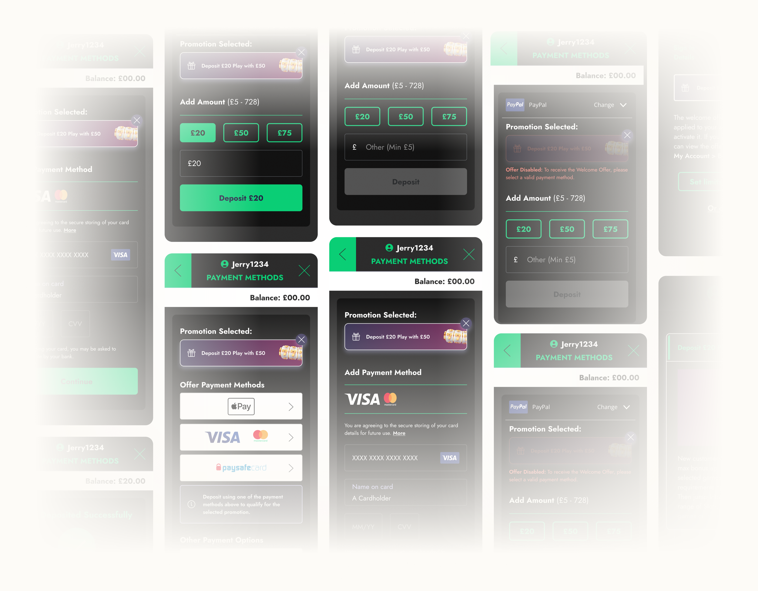
Registration flow: Step three (The Reward)
A new Reward step was added to the registration flow , Step 3 on web and Step 4 on app, allowing users to form a clear mental model of the welcome offer before reaching the deposit stage.
The experience explicitly communicated that the offer had been automatically applied, with a clear option to opt out, reducing ambiguity around activation and eligibility.
Promotion / Bonus Screen
Supporting this, the promotions and bonus screens were redesigned to provide greater transparency. Users could now see valid payment methods and a complete list of eligible games, ensuring they understood how the reward worked before committing.
Users understood the reward mechanics before reaching the deposit flow, reducing expectation gaps and improving confidence.
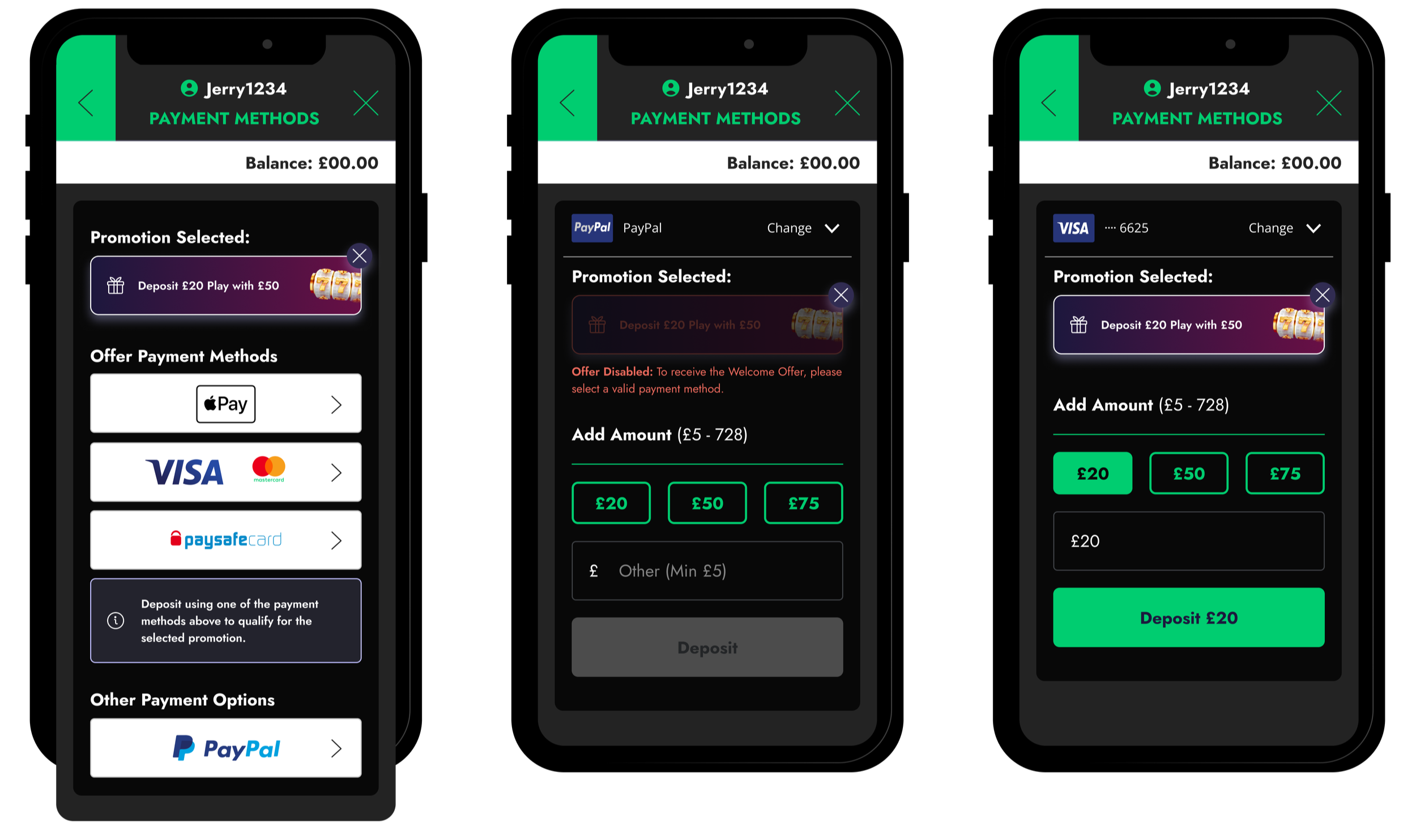
REASSURANCE DURING DEPOSIT | Making the commitment moment predictable
Confidence dropped most sharply at the moment of payment, where users were required to commit real money without clear reassurance that their chosen bonus would apply.
Old Cashier flow
Previously, key restrictions, such as PayPal not being eligible for welcome or sign-up bonuses, were communicated only through a small line of copy above the bonus list, making them easy to miss at the point of decision.
Users were also required to select a bonus before proceeding but could not easily review what each option included, and once selected, bonuses could not be unselected.
Updated Payment and Deposit Flow
The redesigned cashier addressed these gaps by making bonus states and eligibility explicit throughout the flow. The selected bonus is now persistently visible, including bonuses entered via affiliate links, ensuring users always know which reward is active.
Payment methods are clearly categorised based on eligibility, with invalid options disabled and accompanied by explicit messaging explaining the restriction. This removes ambiguity and prevents users from proceeding with incompatible selections.
CLARITY AFTER PAYMENT | Reinforcing trust through clear outcomes
Even after completing a deposit, users previously lacked clear feedback on whether their welcome offer had been successfully applied. This ambiguity often led to uncertainty and follow-up support queries, as users were left to infer the outcome from changes in their balance.
Deposit Successful
The redesigned confirmation experience removes this ambiguity by explicitly communicating the result of the transaction. Immediately after payment, users see a clear success state confirming that the welcome offer has been applied.
The confirmation screen displays both the deposit amount and the bonus awarded, ensuring users can instantly verify the outcome and understand the value received.
By making the system state visible, the experience closes the loop on the deposit journey and reinforces confidence at a critical trust moment.
IMPACT
The redesign focused on improving clarity and confidence at the moment of commitment. Success was measured across behavioural outcomes, user understanding, and operational efficiency to ensure the changes delivered meaningful impact beyond interface improvements.
BEHAVIOURAL IMPACT.
A four-week A/B test targeting 10% of new sign-ups validated the approach before full rollout.
Key outcomes
• +7pp increase in first-time deposit completion
• -6pp reduction in abandonment
• +8pp increase in bonus activation
These results confirmed that improving clarity directly influenced user behaviour at the moment of commitment.
EXPERIENCE IMPACT.
Users required fewer interactions to understand bonus mechanics, and post-deposit uncertainty decreased substantially.
Key outcomes
• Users unsure if the bonus was applied reduced from 26% → 12%
• Time to complete deposit decreased by ~19%
• Bonus help interactions reduced by ~30%
Together, these changes showed that the redesigned experience improved users’ understanding of both value and outcome.
OPERATIONAL IMPACT.
Support data showed a sustained decline in bonus-related queries following rollout, particularly in the largest category of confusion-driven contacts.
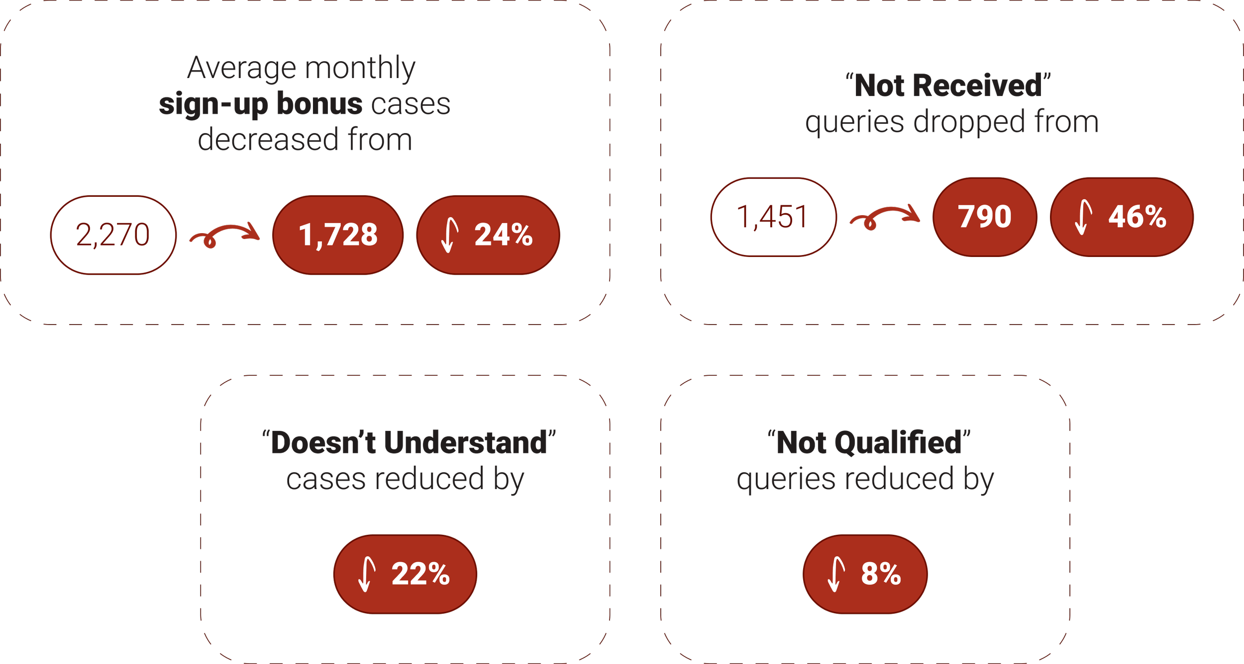
These reductions demonstrate that improved clarity translated directly into operational efficiency and reduced support reliance.
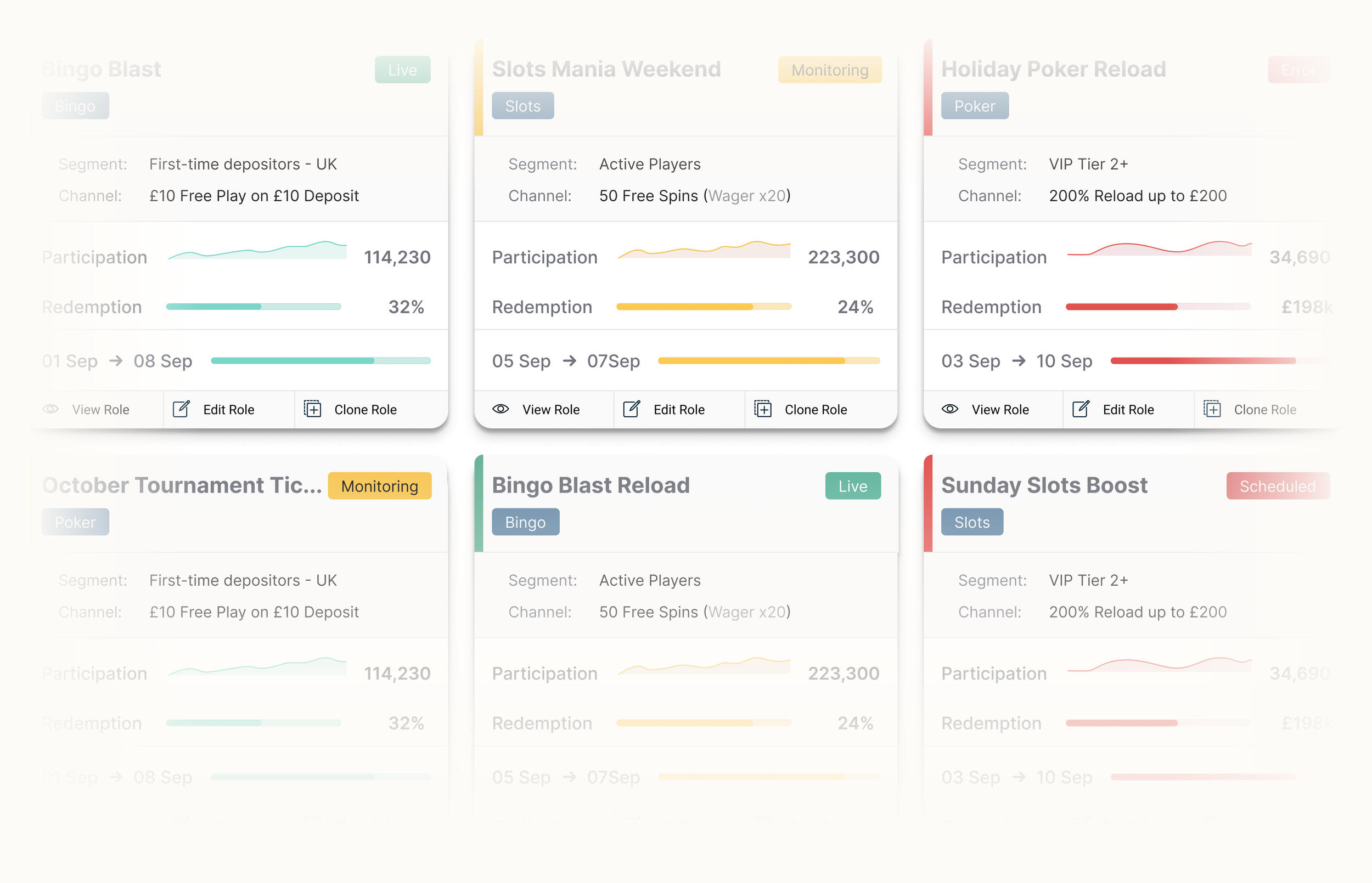
Bonus Engine Redesign
Improving clarity, governance, and efficiency for high-risk promotion configuration
Player Management System
Reducing friction and decision fatigue in high-frequency player management tasks