Designing Trust in the First-Time Deposit Journey
Reframing conversion as confidence at the moment of commitment
GROSVENOR CASINO APP & WEB | SENIOR PRODUCT DESIGNER (UX/UI)
EXECUTIVE SUMMARY
About the First-Time Deposit Journey
The First-Time Deposit (FTD) journey is a pivotal moment in the Grosvenor Casino app — where intent becomes trust and commitment. While acquisition efforts were strong, behavioural data and customer support insights revealed a recurring challenge: depositors were often unclear about how bonuses worked, when they would receive them, and whether their payment methods were eligible.
Problem
Although users reached the deposit stage, ambiguity around bonus mechanics, including hidden eligibility conditions and poor communication around payment method restrictions, caused hesitation, dropped conversions, and increased support load. Users were asked to commit real money without a clear understanding of the expected value or confirmation of bonus outcomes.
Solution
By leveraging backend enhancements in the internal Customer Operations Gaming System (COGS), including a revamped bonus engine, we redesigned the FTD experience to prioritise clarity before commitment and confidence after action. The new flow ensures bonus details travel with the user throughout the journey, highlights compatible payment methods at the right moment, and provides clear confirmation of bonus application on success.
Deliverables
Redesigned deposit/cashier screens with explicit bonus context
A payment selection interface that signals eligibility and errors proactively
Updated confirmation screen reinforcing value exchange and reassurance
Inline validations and messaging informed by support data and behavioural research
Impact
Over a four-week A/B test:
Bonus claim rate increased from 61% → 79%
Bonus-related support cases dropped by 35%
First-time deposit completion improved from 42% → 56%
These outcomes demonstrate that clarity and confidence — not coercive incentives — drive conversion and reduce operational overhead.
CONTEXT & CONSTRAINTS
The redesign focused primarily on the mobile app, which accounted for the majority of first-time deposits. While mobile-first design guided decisions, the patterns and principles were intentionally scalable to the web experience. A full audit of the Registration to First Deposit journey was conducted to identify breakdowns in comprehension, confidence, and bonus understanding.
Regulatory and responsible gambling requirements were non-negotiable and informed every design decision. The COGS upgrade, particularly the bonus engine improvements, resolved systemic issues such as bonus parking and inconsistent bonus application, creating a safe environment to redesign the deposit experience.
Certain areas were intentionally out of scope to maintain focus, including a full registration redesign and post-deposit bonus progression tracking. This allowed the team to concentrate on improving clarity and user confidence at the high-stakes moment of deposit, rather than spreading effort across the journey.
ANALYSIS & DISCOVERY
To understand why users hesitated at the point of their first deposit, we conducted a full audit of the registration and FTD journey. Customer support data quickly revealed a recurring issue: users frequently reached out for help with the Sign-Up Bonus. Many were unaware of how to claim it, could not locate it, or did not receive it, generating frustration and a high volume of support tickets.
Customer support data impact:
Support data highlighted key friction points in the Sign-Up Bonus experience:
September: 2,371 of 8,816 promotion-related support cases (27%) concerned the Sign-Up Bonus
73% of these were users reporting they had not received their bonus
6% couldn’t find the bonus
6% didn’t understand how it worked
We implemented a quick copy prompt above the bonus card in the cashier to clarify that users needed to click to claim their bonus.
January follow-up: 2,389 of 11,503 promotion-related cases (21%) concerned the Sign-Up Bonus (↓ 6% change)
Users reporting not receiving a bonus dropped from 73% → 55% (↓ 25% change)
Users who couldn’t find or didn’t understand the bonus slightly increased (from 6% ↑ 9%), showing residual confusion
Insight: Small, well-targeted copy improvements improved bonus receipt issues but highlighted ongoing comprehension gaps.
DESIGN PRINCIPLES
From these insights, three guiding principles informed the redesign and aligned stakeholders around a shared rationale.
1. Make the value exchange explicit
Users must clearly understand what they receive in return for their deposit, including how bonuses apply and what conditions exist.
2. Reduce anxiety at the moment of commitment
Clear hierarchy, predictable messaging, and separation of information from action help users feel confident when completing payment.
3. Reinforce confidence after action
Post-commitment confirmation should clearly signal success, reinforcing trust and reducing the need for reassurance through support channels.
These principles guided all design decisions and provided a consistent framework for evaluating trade-offs throughout the project.
SOLUTION OVERVIEW
The redesigned First Time Deposit experience focused on improving clarity before commitment and reassurance after action. Rather than introducing new incentives or complexity, the solution addressed specific breakdowns in understanding that were present in the original flow.
This section shows how the experience evolved from the original flow and screens to the final implementation, with each change mapped directly to a guiding principle.
1. Making the Value Exchange Explicit
In the original experience, bonus information was present but easy to miss. Users were required to interpret eligibility, conditions, and required actions without clear guidance, leading many to believe they had not received their bonus.
The redesigned flow made the value exchange explicit before payment, clearly explaining what the user would receive and what action was required to claim it.
With backend updates to the COGS bonus engine, the selected bonus ID now persists throughout the entire journey. This enabled the experience to consistently surface the chosen promotion at every key decision point, removing ambiguity and reinforcing continuity. Users could review full bonus details and terms and conditions before committing to a deposit, ensuring expectations were set upfront and reducing post-deposit confusion.
Registration flow
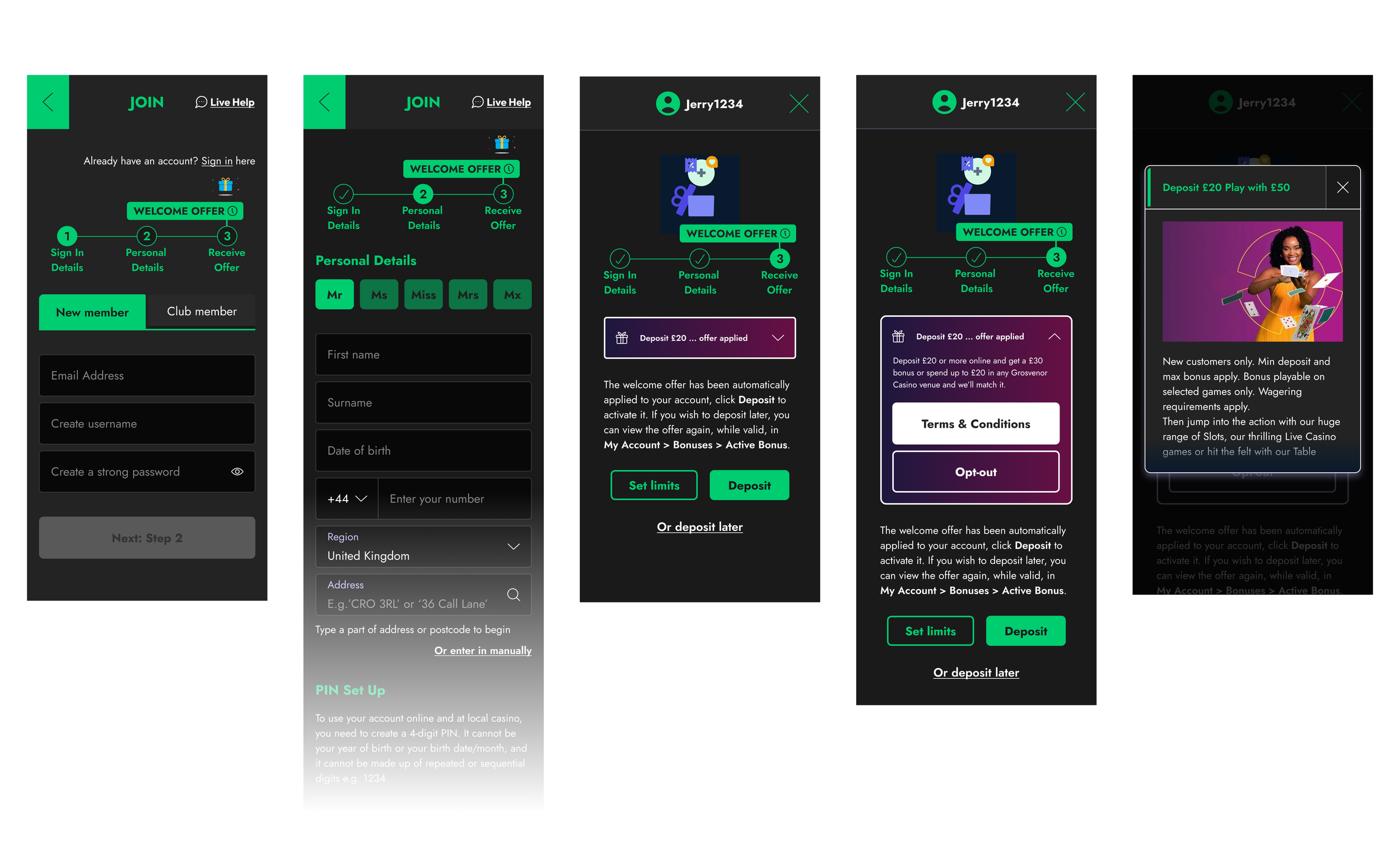
Promotion / Bonus Screen
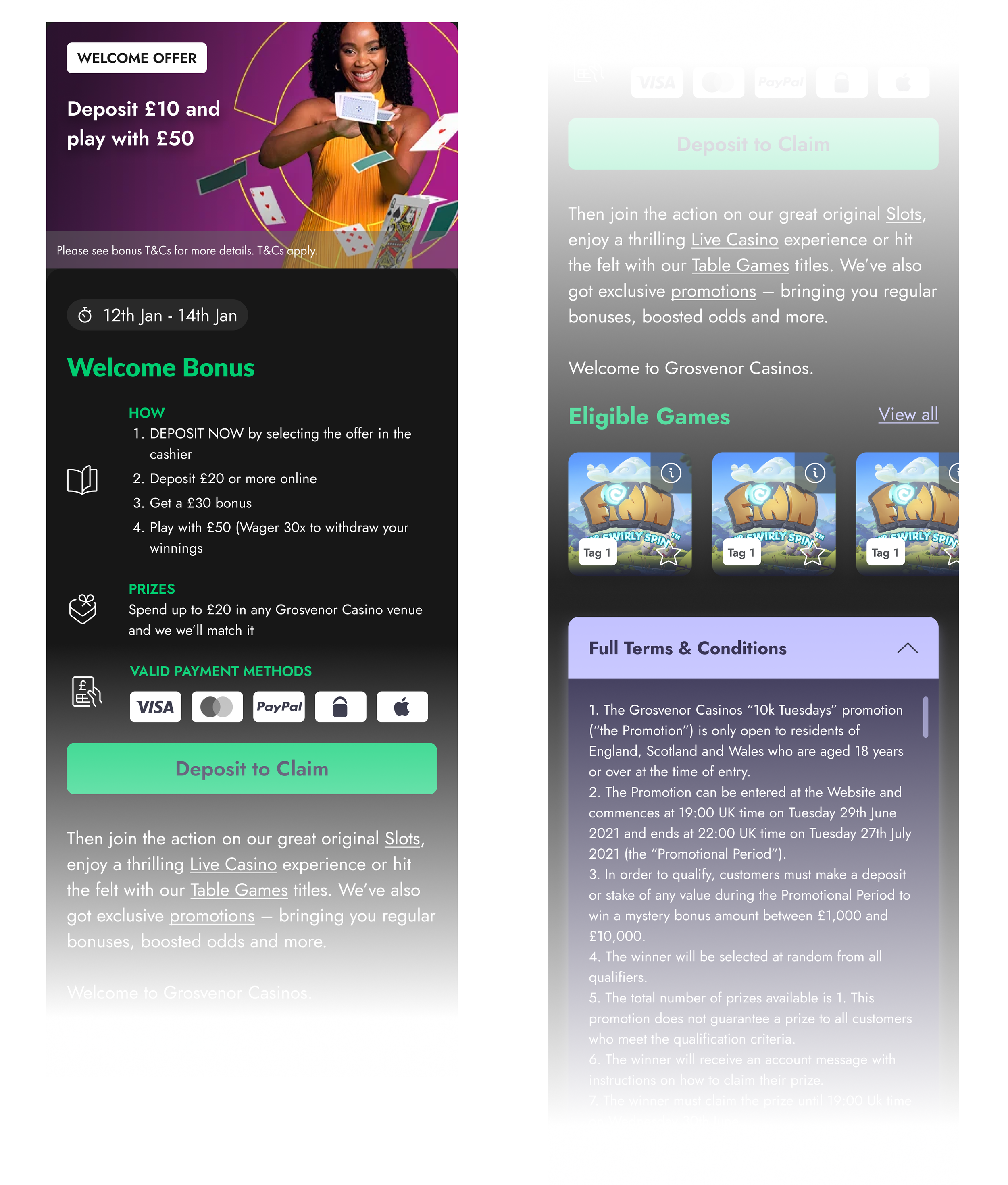
The promotions page was updated to support informed decision-making by clearly surfacing eligible payment methods and qualifying games for each promotion or bonus.
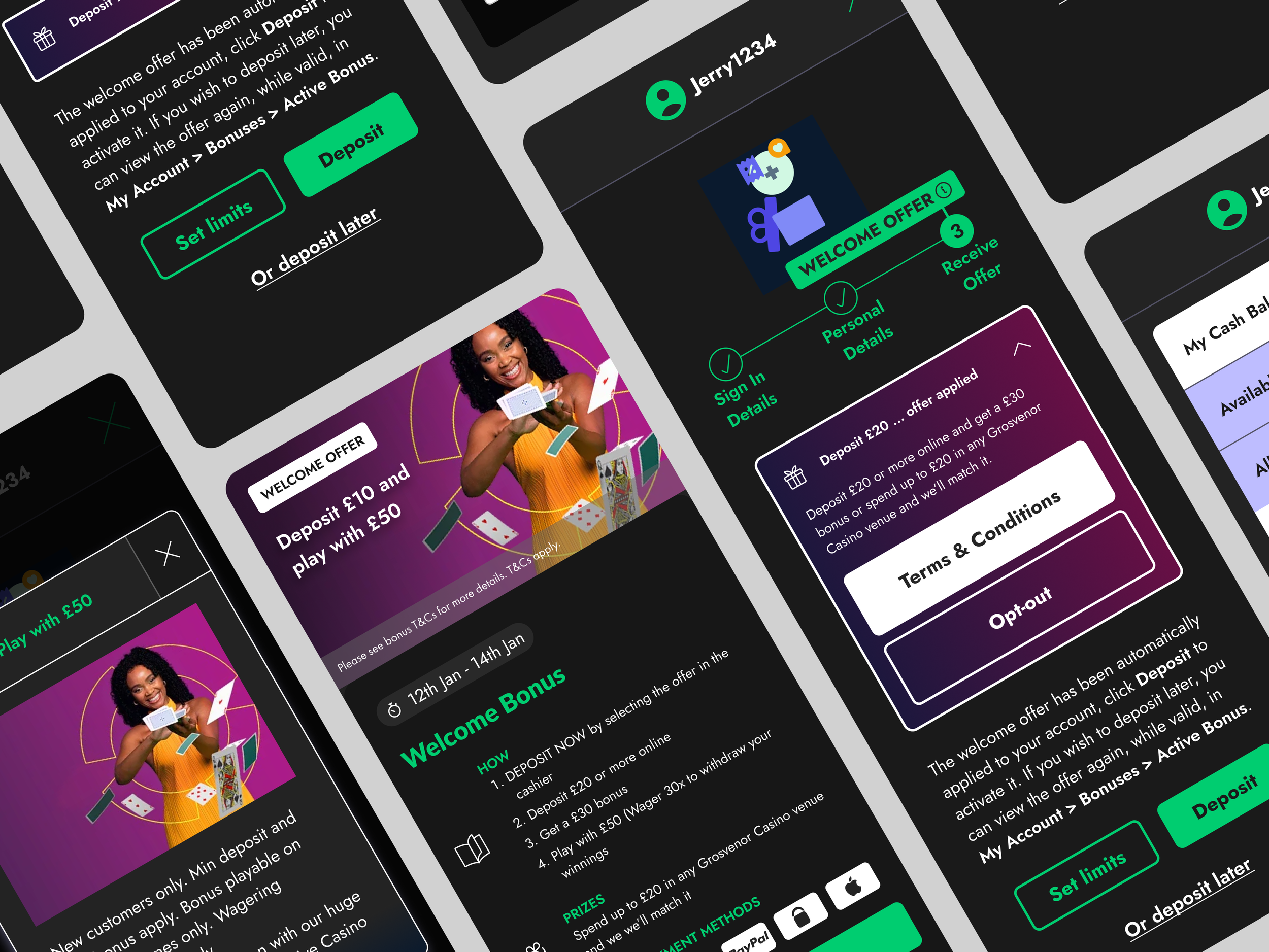
2. Reducing Anxiety at the Moment of Commitment
Previously, the payment step combined multiple decisions at once. Deposit actions, bonus selection, and supporting information competed for attention, increasing cognitive load at a high-risk moment.
The updated design introduced clearer hierarchy and separation between decision-making and action, allowing users to focus on completing payment with confidence.
‘Orignal flow’
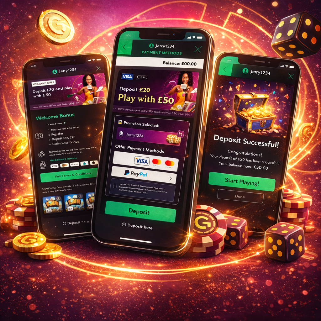
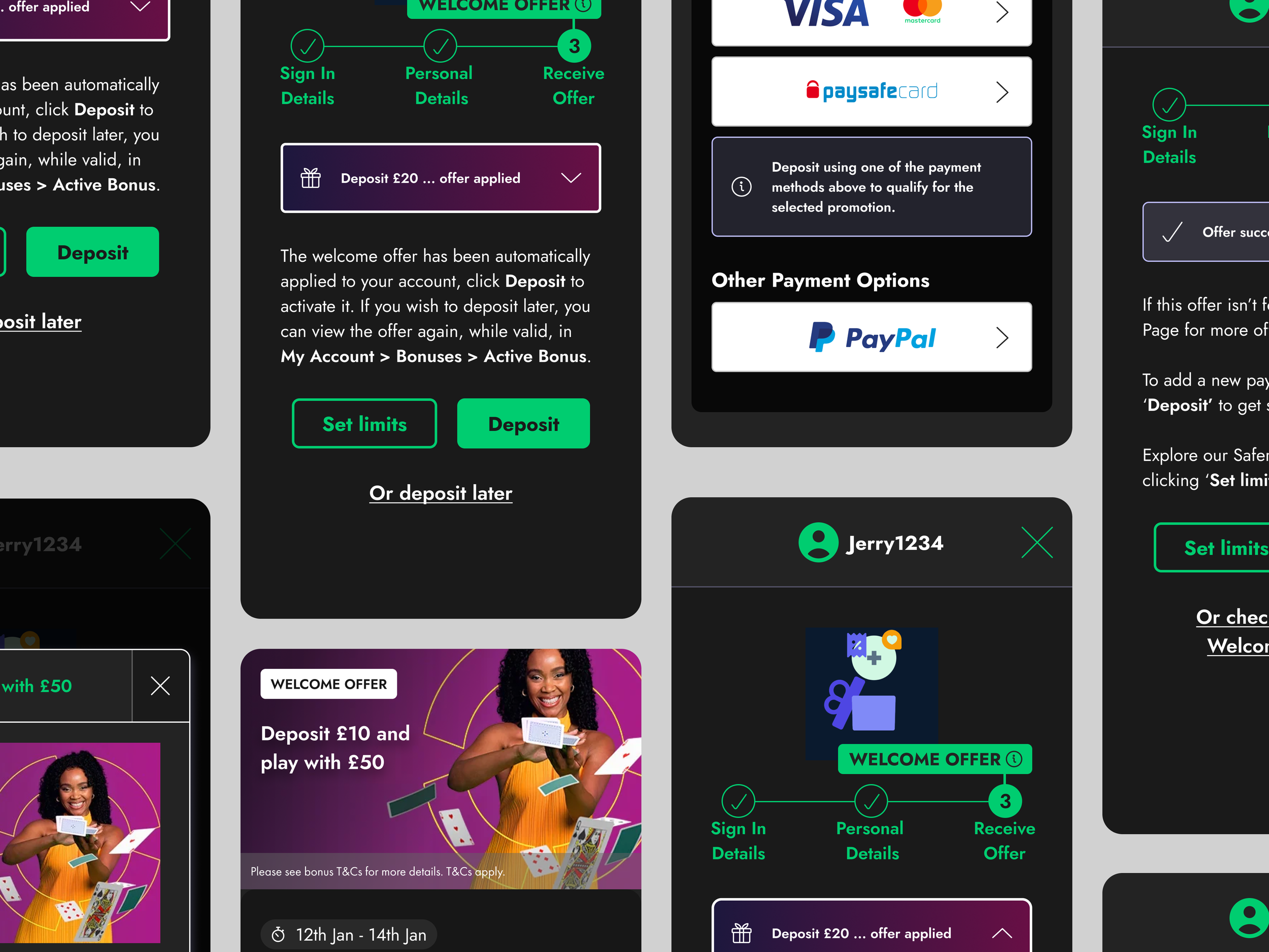
PayPal was not eligible for any Welcome or Sign-Up Bonus. However, this restriction was communicated only through a small line of copy above the bonus list, making it easy to miss at the point of decision.
Users were required to select a bonus to proceed, but could not view what each bonus included before selecting it. Bonuses were only visible in a click state, and once selected, could not be unselected.
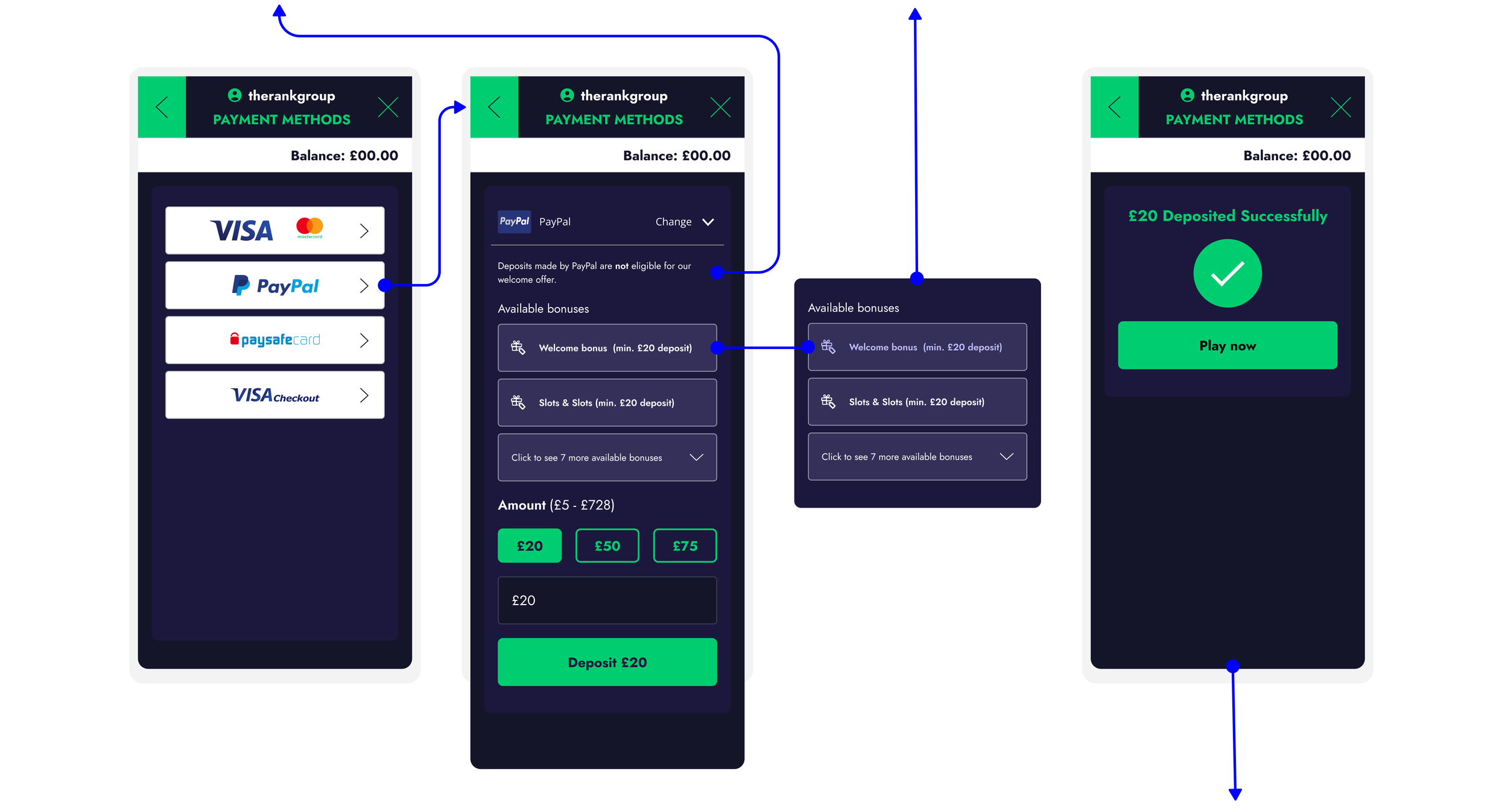
After a successful deposit, there was no clear confirmation indicating whether a bonus had been successfully applied.
‘New flow’
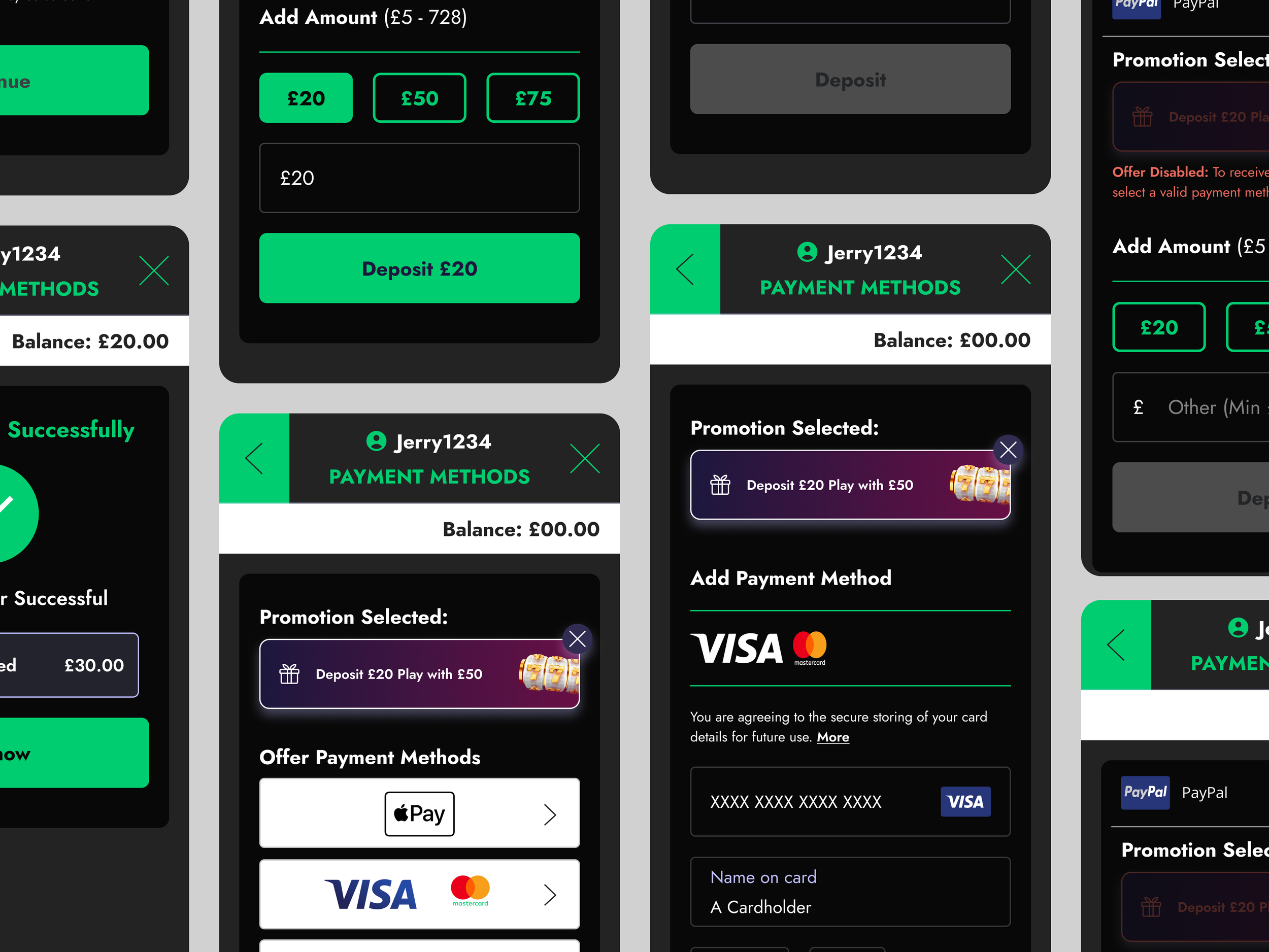
The cashier displays the bonus the user selected, including any bonus entered via an affiliate link. Depending on the user’s choice, the correct bonus information is presented consistently across all relevant sections.
Users attempting to select an invalid method see the bonus card disabled with an explicit error message explaining the restriction.
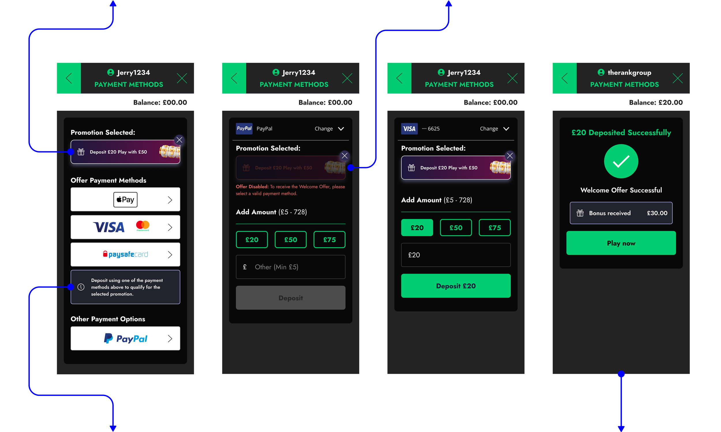
The payment step now clearly distinguishes between methods that are valid for the selected bonus and those that are not.
After completing a deposit, the confirmation screen clearly communicates that the welcome offer has been successfully applied. It displays both the bonus amount awarded and the deposit amount, providing users with immediate reassurance and clarity.
VALIDATION, OUTCOMES & IMPACT
The redesign was validated through a combination of qualitative usability testing and quantitative experimentation to ensure improvements translated into real user and business impact.
We conducted five moderated usability sessions with first-time depositors. Four out of five participants immediately understood how to claim their bonus, confirming that the redesigned flow significantly improved clarity and comprehension. Some users still missed warnings around incompatible payment methods, which informed further refinements such as clearer warning icons, tooltips, and improved visibility of bonus opt-out options.
To measure real-world performance, we then ran a four-week A/B test across 10% of first-time depositors. The results demonstrated meaningful improvements driven by clarity rather than persuasion:
Bonus claim rates increased from 61% to 79%, showing that users were successfully engaging with the offer.
Bonus-related customer support cases dropped by 35%, reducing friction for users and operational load for support teams.
First-time deposit completion increased from 42% to 56%, confirming that reassurance and decision clarity at the point of commitment drove higher conversion.
Beyond metrics, the impact extended across users, the business, and the organisation. Users experienced less confusion around bonus eligibility, clearer expectations at a high-risk decision point, and a calmer, more transparent deposit experience. From a business perspective, conversion improved through comprehension rather than pressure, while support dependency decreased. Organisationally, teams were able to fully leverage the COGS and bonus engine improvements without introducing regulatory or trust risk, internal conversations shifted from funnel optimisation to user confidence, and a repeatable approach for designing high-risk journeys was established.
REFLECTION
This project reinforced a core belief in my approach to product design: many conversion problems are not persuasion problems but trust problems.
At the point of first deposit, users are not deciding whether they can complete the flow, but whether they should. Small, well-timed clarity improvements, when aligned with users’ mental models, can unlock meaningful impact without increasing pressure or risk.
This work helped shift internal conversations from: “How do we push users through the flow?” to a more sustainable and responsible question: “How do we help users feel confident making this decision?”
By designing for mental models rather than funnels, the solution reduced anxiety at a high-risk moment, protected trust in a regulated environment, and improved conversion confidence without compromising responsibility.
From a business perspective, the impact came from leveraging existing high-intent traffic rather than increased acquisition spend, reducing customer support dependency driven by confusion, and creating measurable improvement through clarity rather than coercion.
Bonus Engine Redesign
Improving clarity, governance, and efficiency for high-risk promotion configuration

Player Management System
Reducing friction and decision fatigue in high-frequency player management tasks